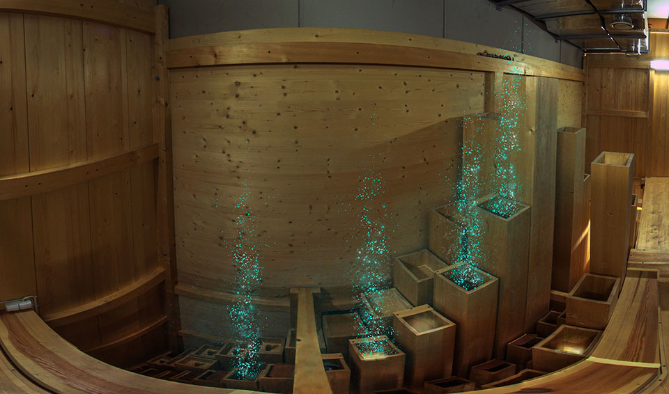
The “Road to Excellence” realization was in many respects different to the documentary production. This project was based entirely on my idea. I supervised the production from the beginning to the end. Unlike in the case of the documentary, I chose deductive reasoning for storytelling development, and I followed my initial intentions through the whole process. The progress from simplicity to complexity is usually more rewarding, especially in artistic research.
In December 2015 I met the general manager Tomasz Beben at Arthur Rubinstein Lodz Philharmonic. The video-performance accompanying the concert by Arthur Rubinstein Lodz Philharmonic Orchestra we did previously was very successful. Getting up a new artistic project together seemed really rewarding. We discussed several technological possibilities, a new performance based on projections, and some film options. I asked about the most important topic for Philharmonic. They had recently opened the first concert hall in Europe equipped with both a Baroque and a Romantic organ. These instruments are tuned differently and built in different ways. This solution reflects nearly the entire spectrum of organ music, allowing the audience to experience diversity in one space. [1] It is a big challenge to compose for both types of organ playing together. Only a few pieces were written for both instruments because of the uniqueness of such a system. The instruments are an artistic challenge both for artists and listeners, and they are the real pride of the Lodz Philharmonic.
Beben wanted to show me the interior of the instrument. Normally, only the maintenance person and the organ tuner have access to that place. Just a few other people had visited it before. The construction of the organ was possible because of the exceptional width of the concert hall. The Baroque instrument is flanked by a bipartite Romantic organ. The former, modeled on the one Johann Sebastian Bach used to play, occupies the middle part of the wall behind the stage. Its design follows the principles of the organ builder of Bach’s time, Gottfried Silbermann. The interior is made precisely in the same way as it was done in the original instrument, with the same materials. The organs are the culminating point of the hall from the artistic and the esthetic side.
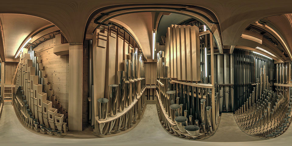
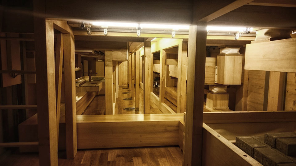
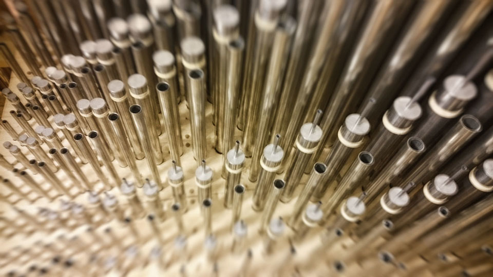
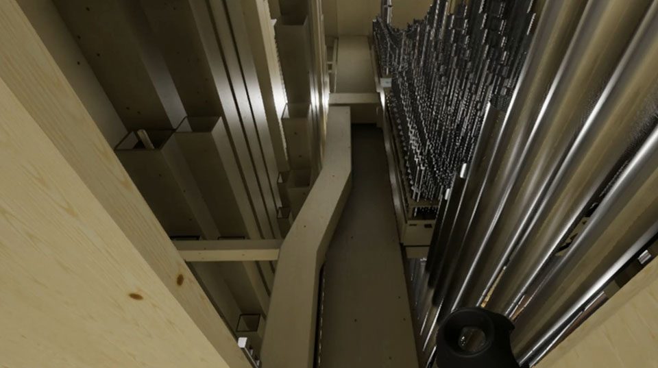
The tour inside the organs is accompanied by an intense emotions. The route is a dark labyrinth, without clues where to go. Tight corridors extend along the whole length of the floor. The claustrophobic feeling is deepened by the openwork construction which allows one to see the vast concert hall through the holes. It is also dangerous. You need to walk on a narrow bridge and climb the steep stairs, up to the height of over three storeys. There is no railing, no safety net, no rope to catch. You are surrounded by sensitive mechanisms, delicate parts whose repairing would cost fortune. You cannot touch them. The pipe organs inside look like a modern sculpture. Wood is mixed with metal, rectangles with cylinders, shiny elements with matte. Above and around one can see thousands of precise components, pipes, wind-chests, manuals, and it all resembles a big organism. A quiet whisper of pumped air gives the impression that this entity is alive.
After the tour, we continued talking. We wondered how to most accurately and most vividly show to the people the inside of this masterpiece instrument. The most promising method to reflect the visitor’s emotions was the virtual reality. At that time, VR technology was still not widespread enough, and its methodology was mostly unexplored. We both were enthusiastic to test the new technology and started looking for a way to make it possible. After several months, I organized the presentation on the possibilities of virtual reality in the Philharmonic. We confirmed that it possesses a high potential for our plan. The project coordinator, Marzena Wisniak, was assigned to work with me. This face-to-face confrontation with the new technology allowed us to test various options, and to create a common platform of understanding for further discussion. As a next step, we needed to prepare a treatment and estimate the costs in order to get the funds.
During the conception phase, I considered my bad experience from the previous 3D animation project. I wanted to make the renderings visually perfect, so I added a high amount of elements difficult for realization: clothes, hair, particles, dynamics, and many more. The resources I had were not sufficient to make it smoothly. As a result, all the work was focused on technical aspects instead of the content. I did not want to overload the Philharmonic realization with too many flashy but insecure elements. They could obscure the kernel of the main idea, and distract the creative process, deviating to less important visual fireworks. This was my first realization in this medium, and I knew that I would have a limited amount of resources. It was necessary to eliminate all uncertain and potentially cumbersome factors. Overcomplicated realization pipeline can prolong the realization cycle and blow up the costs in an uncontrolled manner. I wanted to make it mainstream, a traditional virtual reality application to focus not solely on the VR technology, but primarily on the content.
Virtual reality is such a new medium that everyone has to get accustomed to what can be done, but it is also a tool, like any other. The artist needs to get used to it, in the same way as to the new brush in the collection. The most significant innovation is that, while the classic movies are lean-back experiences, virtual reality gives the audience the opportunity to be part of the show and lean forward. The most important aspect is the immersion. It is more important than the gameplay, even more than the storytelling. You do not need fancy graphics to feel it. The spectator buys almost every illusion as a believable world, but there are rules. The most potent aspect of the experience is “presence”, the immersion in the place. It requires a special position tracking hardware which supports the so-called “6 degrees of freedom” feature. It allows looking around and moving in each direction, while less advanced systems grant only the rotation around the anchor point. When the presentation provides enough cues, the feeling of the “presence” is so strong that you need a while after taking off the goggles to get back to the reality. At that time the only equipment delivering such freedom was HTC Vive. This impression of “presence” was exceptionally well suited for our project, so we had only one choice.
Simply put, our project was based mostly on the reconstruction of the Philharmonic location in virtual reality. This was the main task; all other things were an addition to it. I had to determine the range of space explored inside the virtual space . The essential components were both instruments with three storeys and the balcony. After consultations, I found out that the Baroque organs are more important. Consequently, the presentation of the instruments should be carried out in the proportions of 70 to 30 percent. We wanted to show the differences between them, but the Romantic organs were meant to be shown only as reference. This decision saved much work, cutting down the amount of 3D components created in VR.
My primary intention was to increase the listeners’ apperception and awareness during a real concert by offering them immersive experience in virtual reality before the concert. The best way to do that was to demonstrate the way in which pipe organs create sound. The presentation was supposed not only to show the organs from the inside but also to visualize the musical process. I did not wish to duplicate the audience’s experience from the real concert hall. I wanted my virtual reality presentation to induce in people the desire to see a genuine concert at the Philharmonic.
I started testing the possibilities of the medium, having in mind my intentions. I also did some VR presentations for students, checking their reactions. They were enthusiastic and inspired. This experience of a different reality was the foundation for the story in one of the next students’ films. From my point of view, the intensive exploration of the VR technology delivered invaluable inspiration. It triggered my creativity and opened me to new artistic potential. It was important to start using it from the beginning, not only for exploration but also as a tool. I am convinced that the development of the artistic act should be at least partly pursued in the same medium as the finished realization; this allows opening up for new options.
In each artistic project, it is important to know who you aim your work at, to establish the main target for your presentation. In the new media, such as virtual reality, there are two kinds of audience: the experienced users, and the first-timers. We assumed that the Philharmonic audiences are mostly not experts in new technology and they have almost no experience with VR. The spectrum of potential spectators was narrowed to adults, with the option of showing it to the young. This made it necessary to start the presentation with a short tutorial, and therefore we had to add a training location to virtual reality space.
At that time we did not know how fast virtual reality would spread in Poland, so we decided to make an on-location VR experience instead of preparing it for distribution. During the realization, it turned out to be the right prediction. VR on-location is becoming more and more common these days. Virtual reality became quite standard but it is still not an everyday, conventional equipment for everyone. The aspect of public exposition created a need for maintaining a level of intimacy during events. The feeling of being watched can reduce the level of openness to the experience. I decided that we will need a big monitor showing the transmission from the viewer’s point of view to distract the other people around and direct their attention to the screen, away from the strangely behaving spectator with goggles. We also needed a dedicated place to limit the number of people participating in the event at the same time. The chamber room had this potential of separating the space and allowing to set the equipment properly.
I also had to take into account the needs of the vendor, the presentation contractor company that would work for us. In the VFX industry the vendor is a VFX house chosen for post-production realization because of its best efficiency at a certain type of work. [2] I knew that the basis of my solution would be one of the most popular game engines: either Unity or Unreal. A ready-made development environment is beneficial for the budget. There was a higher probability of finding a capable and experienced vendor. Differences between both systems were negligible because of the low level of our project complexity. The methods of creation in the game based production are similar to those in the VFX realization. In this particular case, the most important issue was the creation of realistic 3D space which would also be optimized for VR equipment needs.
The visuality and interactive character of “game type realization” may create specific connotations among the inexperienced, especially old generation audience. It resembles the lack of appreciation of computer generated art in the last decade. It was the reason why I wanted to include 360-degree videos. This was the easiest way to introduce a live actor and make the overall reception more “organic”. One of my ideas was to increase the comfort of exploration by adding Leap Motion hardware. This extension is an additional hand tracker attached to the front of the headset, allowing to create the impression of seeing bare hands and operating them in virtual reality. After tests, I gave up this idea because it required additional training for a newcomer and would make the tutorial longer. The pipe organ project had many unknowns and demanded additional time for experimentation and adaptation after the initial development. It was impossible to predict all the problems we may encounter. The concept was designed in such a way as to leave us some freedom of choice at the beginning of the final production.
Technology is becoming obsolete very quickly. The life expectancy of each generation of VR hardware is estimated for two to three years. Game based realizations are getting old as fast as the equipment. Especially their visual side is vulnerable to become outdated. This phenomenon is similar to the aging of CGI-based special effects in blockbusters. Usually, artistic values of a new media realization degrade in half a year to four years. Due to the software development, it is possible to produce more detailed and complicated realizations in short intervals. The knowledge about the new medium increases, allowing more advanced and more accomplished artworks. The expected life span of the pipe organs presentation was assumed to be maximum five years from the implementation.
It was important to create cost estimation, not only for making the software application but also for the exhibition hardware since the Philharmonic did not own virtual reality equipment. All the available VR equipment was permanently on the prototype level, and its installation was cumbersome. I took under consideration using additional headphones for reproducing binaural sound, but instead, I chose the more convenient Deluxe Audio Strap. We needed extra tripods, a protective case, a wireless connection to the monitor and the wireless keyboard to assist the spectator remotely. The growing tendency was to use a backpack PC as a computational unit, and I decided to include it. This solution allowed to eliminate the cables and was more presentation friendly. Another concern was hygienic safety of the equipment, since it was planned for multiple-use exhibition purpose. All in all, a proper strategy was crucial, and I was the only virtual reality expert at the Philharmonic, so I had to make all the compelling decisions myself.
The planned budget was not enough for a complicated, game type realization but seemed sufficient to reach our goals. We applied to the European Structural and Investment Funds and received a grant in November 2016. The next step was to write and announce the tender. All these tasks were part of my regular responsibilities as a creative technologist. Cost estimation is a VFX supervisor duty as well. It is directly connected with resource management. Nevertheless, all the equipment responsibility was directly relevant to the creative technologist domain. In June 2017 we finally chose the vendor, and we could start the production.
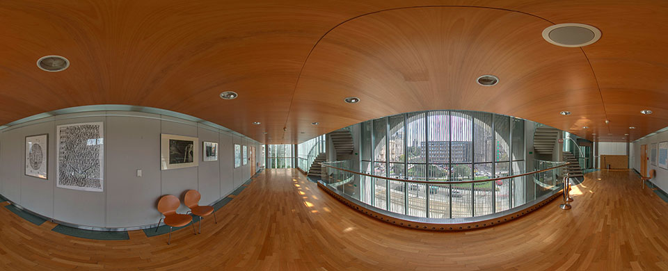
I needed the comprehensive documentation of the place to maintain remote supervision over the realization. It was also necessary to provide this documentation to the contractor company. The access to the interior of the organ was highly restricted. This documentation, along with the construction plans received from the Philharmonic, allowed the contractor to start working on the organ model immediately, without waiting for the finished script. Making documentation was quite a challenge. I wanted to create high dynamic range panoramas from every possible location inside. When I moved around inside the instrument, it felt like wall climbing without protection. I had to keep balance like walking on a tightrope and squeeze through the tight and delicate construction, holding the tripod with the camera. The next steps were to find a proper place for the exposure, to press the delayed shutter button, and to immediately hide out of the view of the lens. It was extremely difficult, and I could not delegate it to someone else. I also tried to make photogrammetry inside, but it was useless since we had all the construction plans. The textures had to be entirely procedural to optimize them for a demanding virtual reality application. Like in the Icelandic film project, the documentation was treated as the final source, and the vendor used images as a background projected on the sphere in the concert hall and in the tutorial location. My panoramas had an enhanced range of luminosity, so they were a good source of lighting. Every full panoramic HDR image is in fact a light probe, capturing and preserving lighting information. [3]
The documentation allowed me to work remotely on the script. The Philharmonic assigned the organ expert Krzysztof Urbaniak, their artist in residence, to support me with specialist knowledge on the pipe organ. In the beginning, we made a list of location descriptions, and we connected them with panoramas. We used files on the cloud to allow easy access for everyone from the team.
Creating the story for virtual reality resembles screenwriting on steroids. Your goal is to adapt storytelling and your audience to another realm of experience. Even if it tries to be realistic, it still constitutes a simplified version of reality. It reminds oneirism, a state of abnormal consciousness. You are living the story with the characters, not separated by a screen. I started my work with an attempt to imagine myself inside the story I am creating. I was the main character, the organist's helper. I was in a particular place and had a particular a task. Virtual reality is still an isolating experience. You put the goggles on and then you are surrounded with the computer-generated word without other humans. To break that feeling I decided to add the narrator, hidden somewhere inside the instrument. We can hear his voice, and we have a feeling of being observed. The narrative creates emotions and naturally draws the viewer's attention. The narrator tells us what to do, supports us in difficult moments. To make this illusion more believable, I decided to include a starting film sequence to show the narrator. This was the easiest method to bring the realistic character to the presentation. Digitally created humans are the most expensive elements of games and special effects. The theory of the uncanny valley proves that this task is extremely difficult. The comfort of the observer increases as a character becomes more human stylized until a certain point at which observers start to feel uncomfortable with an almost, but not quite, human like character. [4] My solution resembled old games where film sequences were mixed with gameplay.
Eye-stops within the frame, typical of the film, do not exist in virtual reality, because the viewer’s camera moves around. Instead, you have to consider the areas of focus. The 360 space composition of the introductory movie consists of two such areas: the organist zone and the environmental background. Spectators new to virtual reality are hesitant to turn their heads and look around. They are used to facing stationary screens in front of them. This compositional duality aims to provoke the viewer to break this first barrier. The user is incited to turn around to the character. The voice audible from behind gives a hint that somewhere there is a person, talking. At the end of the film sequence, the narrator opens the doors and goes into the instrument. After that, we will hear his voice from inside.
The process of searching for a universal language of art in virtual reality, similar to synthesizing arts within son et lumière open-air shows, reflected my desire to further simplify the form of pipe organ imaging. It was also the reason why in the Philharmonic presentation I gave up using “spatial montage” which I used in documentary. Contrary to the film, this method is quite popular in virtual reality. Various holograms are often imposed on the background image, especially in the futuristic stories. It is also used as a visualization of the portals for transportation. Temporal montage is much more limited here. It is one of the VR principles. The fast cutting between scenes may cause motion sickness.
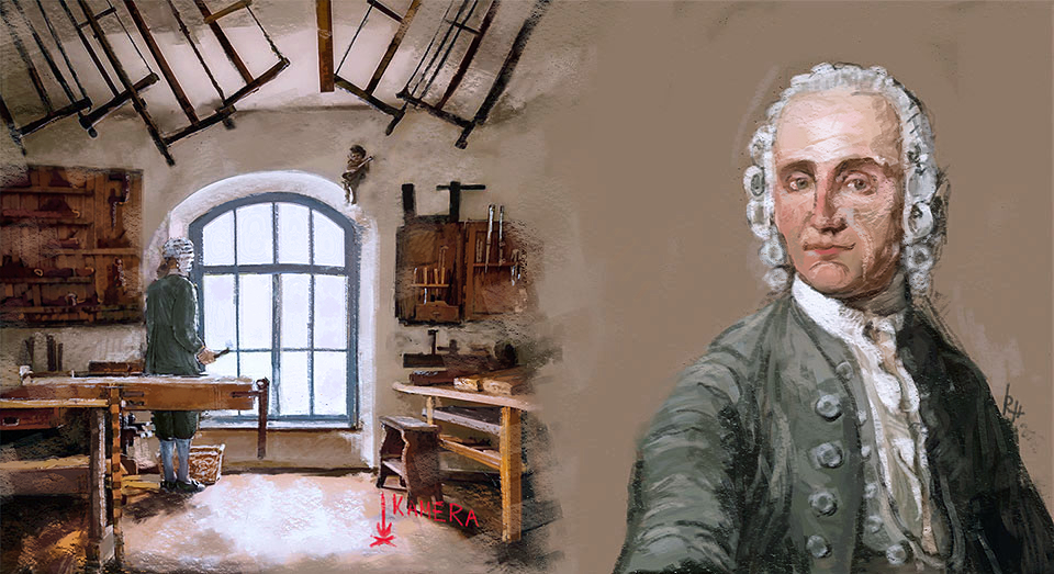
The claustrophobic interiors could make you feel sick as well. Some people are afraid of confined spaces, others could find the monotony of the expression tedious. To eliminate this distress, I added an Easter egg in the middle of the presentation. This additional film sequence woven into the story was filmed in the Gottfried Silbermann Museum in Germany, in a room stylized on old organ workshop. It provided a short break in the plot to soothe the discomfort and increase the feeling of the monumentality of the organs compared to the small room outside. I also used the film sequence at the end of the presentation. As a reward after completing the tasks, the spectator can see the organist playing the organs.
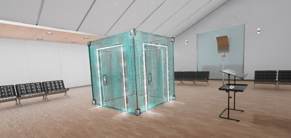
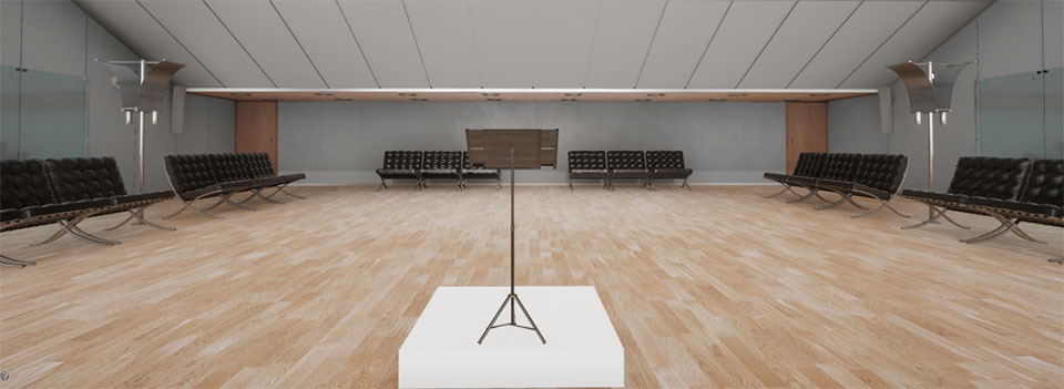
Every time-based artwork should have a visually intriguing start to hook up the audience attention. For most new users, the tutorial is actually the first contact with the presentation. I wanted to start the show with an attractive first impression. As a location, I chose the largest foyer in the Philharmonic. To create a linking context I put in the center the conductor's desk with some props: sheet music, a small pipe, a tuner tool. It gave the spectator the reason to look around and to play with the objects. I wanted to engage their attention from the beginning. Interaction by means of handheld Vive controllers increases the immersion. Moving between different places is done by "teleporting jumps", so the final step was to learn how to move around. Finally, I added the option for more advanced users to skip the tutorial by going directly to the transportation cube in the center.
Virtual reality introduced the sense of “spatial immersion” and “emotional immersion”. The first one is associated with the environment and the spatial composition of the scene. We can feel our presence in a particular location more strongly. The second one is significantly more immersive in terms of the sense of “being there”, realism, the sense of engagement and sensory cues. It is related to deep engagement in a challenging task. The user feels emotionally absorbed by the narrative content. [5] Constructing the detailed plot, I made some additional assumptions. The main spectator’s task is to prepare the Baroque organs for the concert. The assignment consists of several typical maintenance works. The exploration is in the style of Alice in Wonderland: we follow the rabbit deep into the unknown. Some parts of the interior are available only after completing key tasks. Interactivity combines with exploration.
Focusing on objects that are close actually does not exist in virtual reality. Convergence is set to infinity, although the use of new eye scanners may change this. Environmental cues are essential for directing the viewer's gaze into the right place - lights, sounds, and movements in the environment help to focus attention. I tried to distinguish the signal light by making it green, but the color did not fit the overall design. Instead, I increased the brightness of it. Finally, I designed some additional visual effects which were meant to show the essential features of the instrument. All the concept work I made is standard in the process of feature VFX production related to storytelling.
The number of assembly cuts was reduced to a minimum to increase the realism of exploration. Instead, subconscious cuts appeared in natural positions like doors or stairs. In reality, passing a door is perceived by the mind as an assembly cut. The main job of a virtual reality designer is to avoid things that break the immersion. Touching and manipulating objects increases involvement. I wanted to improve the level of emotions inside. For this reason, I introduced a sound warning when the spectator touched specific organ elements. He or she could fall down from height, taking a step too far. Usually, fast camera action without a corresponding body movement increases the motion sickness, but this quick falling animation strengthened the impression of danger. I added some more surprise effects, such as unexpected loud music or unexpected visual effects inside.
During the first encounter with virtual reality, a new viewer generally has a low level of resistance to extended heavy presentations. I decided to plan three different gameplay strategies. The first one is for users who are eager to follow the instructions and want to complete all the tasks. It ends on the third floor, when the viewer grabs the sheet music, as the last task in a row. The second strategy is for the users who do not want to follow commands and want to explore the interior in their own way. Both strategies have a time limit. After ten minutes, the gameplay jumps to the last film sequence. There is also the third strategy for more advanced players without the time limit. It allows exploring all aspects of the presentation, looking closely at the interior, and discovering additionally hidden attractions.
While refining the script, I coordinated the teamwork with the production director on the vendor side. The first step was to create a 3D model of the organs based on construction plans. Then all objects were assigned textures. The progress of the vendor’s work was provided in form of screenshots. After importing the model into the game engine and initial programming, I could assess the interior and find all the errors. In this type of production, the first version of the software application can serve as previsualization. I needed to consult the 3D model with the expert, Urbaniak, because the screenshots were not precise enough. He could assess the correctness of the construction, and we could discuss the story flow in a different location. The problem was that Urbaniak did not have virtual reality equipment and we were in two different countries. I had to develop a hybrid virtual teleconference solution based on my virtual reality headset. When I was exploring the virtual instrument, Urbaniak could see the image from my virtual camera on his laptop. He was giving me instructions on where to go and what to look at, and I was making notes. In this way, I could create a bridge of creative communication between the music department of the Philharmonic and the digital realization team. The similar method is used in contemporary special effects production, but instead of having just one headset and a flat screen, the whole team is equipped with goggles through which they can see the same space. This also signals the birth of a new specialization, a “VR Scout”, a person tasked with investigating locations for VR based experiences.
Apart from making construction mistakes of the virtual organs, the vendor team unnecessarily used their own invention and added to the presentation elements reminiscent of science-fiction style. Cyber hands were used instead of controllers, and the sparkling navigation lights looked like Star Trek teleportation. They restricted movement to some selected points of interest, and they added icons with small animated feet. These improvements were stylistically wrong. I knew this was not the stylization that the Philharmonic recipients would expect. It was suitable for a different audience and did not fit the subtle sophistication and the monumental appearance of the pipe organs. Maintaining clear stylistic and narrative unity is also one of the creative technologist’s duties. Another important thing is to make sure that the spectators’ free choice does not kill the story. The viewers should have the freedom of movement, but their decisions should be discreetly guided.
Following my corrections and modifications, the more advanced version was prepared. This time it was more interactive and had a more developed plot, which made it more suitable for testing. The game type production is quite different from the feature realization. In many cases, the only way to prove what works and what does not is to build it and try. The iterations in the game engine are more easy to do and are not a burden on the budget. It is much more difficult to change the general idea of a presentation or elements which require multiple separate works. The knowledge which corrections are safe and which are potentially troublesome is crucial in a creative technologist’s job.
360-degree movies realization required a different kind of approach, one similar to the feature production. I wrote additional scripts and created the concept art for each. The arrangement of the set was easy to plan. On the organ’s balcony, the camera was located close to the sitting organist but turned at such an angle that the organist's mouth was not fully visible. It allowed swapping the sound track between the Polish and the English version. We chose four different organ works to play: the fragment of Sigfrid Karg-Elert’s symphonic chorale “Ach bleib mit deiner Gnade”, Felix Mendelssohn-Bartholdy’s “Sonata in A major” and the fragments of Johann Sebastian Bach’s “Fantasia in G minor” and the chorale “Ach, was soll ich Sünder machen”. They corresponded to the style in which the Baroque organs were built. The music was performed by Urbaniak, and he also played the organist in the movie. The recording of the organ music was made at several measuring points to fully reproduce the sound based on the acoustic conditions of the concert hall. It was recorded outside the instrument although the music in virtual reality appears in several locations inside. The loud distorted sound could spoil the immersion, and we wanted to avoid it. The essence of our virtual show was to present the impression of the real experience and its artistic interpretation.
In the museum scene, the camera was located in the middle of the workshop. According to my script, in the room there was a figure dressed in the eighteenth century costume. We needed a white wig with curls, a frock coat, white knee socks, and black shoes with buckles. I made concept art and created sketches for the costume. I could not be present on the set in Germany, so I made a list of detailed directions. All modern items had to be removed, if possible, from the camera’s view range. Outside the window, cars should not be parked. Virtual reality should give the spectator the impression of traveling in time.
The vendor used my high dynamic range panoramas in the final presentation. It facilitated the production but also created a problem after shooting. Instruments on the stage were differently arranged. When I was making the panorama, I did not know yet that it would be used as a background. In addition, the film footage had a much lower resolution and quality than the still panorama. It was impossible to improve its condition up to the level that was efficient for matte painting. Consequently, I needed to take another panorama. This time I arranged the instruments properly and positioned the tripod precisely at the same place as the shooting camera stood. Matte painting allowed me to improve several elements, make the Philharmonic logotype on the opposite wall more visible and correct all the errors of the movie. The film from the museum also needed some retouching. I had to get rid of power sockets, speakers, people walking outside the window, and a heater. I added burning flames in lanterns hanging from the ceiling. The panoramic filming requires careful planning because the post-production is always laborious. The more you can improve on set, the less work is to be done on the computer. The automatic stitching process is never perfect. It requires additional work and roto painting. I used Nuke with Cara VR plugin to correct stitching errors and make compositing. This is the most popular tool for VFX post-production in the industry but it is also very demanding and resource heavy.
Audio is another important element of immersion. In addition to the music, we recorded plenty of other sounds inside the organs. Each interaction, like an opening door, touching the pipe, or putting away the item, should have its own, unique sound. It turned out soon that the base of sounds we have is too small. I recorded additional sounds myself but some of them I had to create directly on the computer. On the balcony, two big pipes move out of the instrument and hide after a while. There is no natural sound that could accompany such an animation. I had to design its tone myself. The teleportation sound is another example of such a creation. It had to be adequate to the mood of the presentation, and I had to design it from scratch. In the end, after the last film sequence, the credits are shown. This is traditionally the moment when the spectators get to know that it is time to take off the headset. I did not want to leave this part silent and I decided to add a background noise of a crowd waiting for a concert. This was additional work, which was not included in the normal production schedule and I had to do it myself. I also found out that the voices are too flat, you can hear them in the middle of your head. To improve it, I added reverb and edited all errors. The sound design and editing are not the typical tasks of a creative technologist, but they show the need for versatility in this profession, especially during the new media creation.
A person who experiences the appearance of motion while their body remains still reacts with an increasing sense of discomfort. Motion sickness causes symptoms such as headache, irritability, vertigo, nausea or vomiting. Only a small amount of population is immune to that distress. The reason why virtual reality can make a viewer sick is the intense illusion of being in another place. It is closely related to people’s spatial cognitive capability, due to a mismatch between the information that the person receives through his inner ear and eyes. The working version of the presentation had many errors causing the motion sickness. The user movements occur in narrow corridors and confined spaces. In similar cases, VR applications allow the possibility of penetrating through the objects. In our presentation, this option would have disastrous consequences for the consistency of the story. If the viewers could freely walk through the walls, they could see unsuitable parts of the space, and the whole storyline would be spoiled. The first solution of the vendor was to limit the minimum distance between the head and the surround. After crossing a certain range, the surround began to move away from the viewer. It immediately triggered motion sickness. I found out that a better solution is to gradually darken the view when the head is close to the obstacle, up to complete blackout, and to turn the visibility on when the user moves their head back. It was a clear signal for the viewer how to behave in virtual space. Dealing with this problem was an important part of testing the prototype. The lack of continuity in immersion was another issue I had to cope with. If the immersion is interrupted, the viewers are very aware that they are wearing goggles, and may become annoyed with the whole experience, no matter how good it is. For instance, at one time the realization team, contrary to any suggestions, put a small white platform beneath the conductor's desk. They wanted to distinguish the central place in the tutorial, but instead they prompted the users to try to step up on this platform, which was purely virtual. This not only created a threat of injury, but also resulted in the fact that the shock spoiled the feeling of immersion.
During this phase, I made a tremendous amount of various tests. I showed the presentation to various people and gathered their opinions. I was testing it in the Norwegian Film School to have the second opinion not only from amateurs but also from film professionals. Organizing this kind of beta testing is typical of the supervisor work. The improvements were made, and we added some special effects in order to intensify the mood and differentiate the instrument parts. Finally, we showed it to the musicians in the Philharmonic. This demonstration was supposed to be the last one, but the virtual reality application was still far from perfection. Some viewers did not want to follow the ordinary path. They made atypical and unexpected actions. The presentation had to be insusceptible to such activities. There were also some compliance issues with the script. Storytelling was broken in several points. I started a new round of tests. In the end, I made a long list of errors, over twenty pages. Only after these improvements could the work be considered as finished.
A creative technologist’s duties in a feature film and in virtual reality are similar, in spite of different means of expression. Virtual reality, like a game production, contains an extra feature, interactivity, which allows the spectator to participate in shaping the individual variation of the show. Traditional cinema has the director’s vision embedded, while during the interactive show the director is more like a master of a ceremony. Immersion, presence, and reality trade-off are the means of artistic creation. In a realm of new possibilities, the level of acceptable simplification is higher. It makes the world seen through the goggles the ideal creative environment for artistic experimentation. Virtual reality uses perception tricks in shaping the verisimilitude in the mind, but in truth, we do not really understand the brain that well. You have to be aware that you are provided with a powerful, yet not enough elucidated, tool of interaction with the audience. All your wrong decisions may harm the spectator in a physical and psychological way. This is particularly important in today’s initial stage of adaptation of the new technology.
Without proper development, you may end up producing the work addressed only to a very narrow audience with an expertise in virtual reality. The technical side of the medium is becoming transparent by the purposeful use of immersion. It is essential to avoid factors that draw the viewer’s attention to technological aspects. It takes a variety of skills to communicate between teams, to connect internal and external developers with one another across different domains. Virtual reality changes standards and the way to achieve a satisfactory result. A creative technologist is a professional who bridges the worlds of artistic design and technological development in order to create delightful, engaging, and cohesive experiences.
