THE STATE OF THE ART
Analyses of contemporary material are necessary because there is little literature on facsimile artists’ books. If we look at existing literature we can distinguish two types; first, there are critical anthologies in book form and, second, there are independent articles by authors who have an interest in artists’ books but wrote about the medium only once or rarely. One of the earliest anthologies is Joan Lyons’s Artists’ Books: A Critical Anthology and Sourcebook, with articles by Lucy R. Lippard and Clive Phillpot. Other often referenced literature includes books by Johanna Drucker, Sefan Klima, and Cornelia Lauf and Clive Phillpot, all published at the end of the 1980s and 1990s, spreading a certain collective admiration for the uprising of the artist book phenomenon. They form the first bodies of work that gather critical writing about the than twenty-year-old medium. Of course, there are some critical voices, especially that of Lucy R. Lippard, but these mid-1990s anthologies turn very much around the definition of the artist’s book and what this new medium engages and triggers. When
we advance a bit further and look at more recent sourcebooks by Clive Phillpot, Anne Mœglin-Delcroix, and Leszek Brogowski, we still see an excessive focus on examples from the 1960s and 1970s, and on republishing already written articles in the case of Phillpots’s Booktrek. All the literature concentrates on the first twenty years of the artist’s book uprising, and somehow stops at the 1980s. It is difficult to find good literature covering artist’s book practice from 2000 until today that reflects specifically on changing production methods, the increase in book fairs, and the trend for self-publishing, not to mention the absence of facsimiles in contemporary literature on artists’ books. For these angles of reflection, one is tied to the few articles circulating on the Internet. Jérôme Dupreyat wrote a review about the ‘Reprint Collection’ by Éditions Zédélé, in which he counts both the original version and the reprint of an artist’s book as ‘an inherently reproducible and re-editable work.’33 Michael Bracewell wrote the article ‘Editions of You’,34 published by Frieze magazine, which discusses the revival of self- or independent publishing and takes into account reprints and re-enactments of classic novels by artists. Ben Mauk wrote the review ‘No Sale’35 about the latest Berlin art book fair in which he links the authentic, bohemian identity of the Berlin art scene – the book fair as an excellent example – with the economic value of this lifestyle outside Berlin. Furthermore, there are several interviews available on artbook.com with key actors such as MoMA librarian David Senior36 and Ed Ruscha.37
Artists’ books, which once allowed artists to avoid meddlesome institutions and galleries in producing and distributing artistic work, today have a paradoxical existence. On the one hand, there are the extremely rare founding books, termed ‘first edition’ or ‘original’, and, on the other hand, there are ‘facsimile’ editions, which entered the artist’s book realm to counteract the scarcity of the originals by offering re-enactments and reinterpretations of famous titles.
This article underlines a curiosity for practices of appropriation by artists and publishers, and aims to expose methods and discourses in the production of facsimile artists’ books.
INTRODUCING THE RESEARCH QUESTION
From the late 1960s onwards, books have been exploited as a substantial part of artistic practices. The artist’s book became a new form of expression that uses the book as a canvas for an artistic work.1 The artist’s book is a work of art in itself especially conceived for the book format and often published by the artist him- or herself.2 The content could be anything that the artist wants to express to his or her readers; there could be texts, sketches, photographs, and these could be related to one another or perceived as separate items. The artist’s book is like a portable exhibition, but differs in that there are no external curatorial opinions reflected. The book permits the artist to express purely personal reflections and avoid misrepresentation by critics or other intermediaries.3
It was Ed Ruscha’s Twentysix Gasoline Stations (1963), followed by his Various Small Fires (1964) and Some Los Angeles Apartments (1965), that dominated the conception of artists’ books in the late 1960s. Ruscha’s books were a landmark starting point and an enormous validation of the book as a legitimate medium for visual art. His work and that of others, like Sol LeWitt, Marcel Broodthaers, Lawrence Weiner, Dieter Roth, set the tone of what would become a new genre in visual art: conceptualism.4 The art world took considerable notice of artists’ books in the late 1960s, when Seth Siegelaub started to create independent exhibitions in book form that had a broad scope. His catalogues – similarly to a group show – offered a number of pages to each artist instead of a wall or a number of square meters.
From a graphic design point of view, the artist’s book is a weird apparatus. The book, usually designed and typeset by the artist him- or herself, suddenly serves as a canvas for infinite artistic expression. I find myself in a field of expertise – designing books that disseminate artistic thoughts and ideas – that seems to be that of the graphic designer, but isn’t solely anymore. The canvas of the book is used for artistic expression, but the interference of the graphic designer doesn’t seem necessary today to accomplish an artist’s book. Besides different personal approaches to structuring a book, artists and graphic designers are profoundly distinct in their working methodologies. Graphic designers merely collaborate with clients and respond to a set of rules when working on a commission, while artists create from their inner selves, not necessarily taking into account the commercial or marketing interests of others. But even if an artist’s work is free from the influence of a client, it is still strongly tied to museums and galleries that are interested in exhibiting and selling. In the 1960s and 70s, this institutional attachment was felt as a lack of freedom, which pushed artists to explore other mediums in which to communicate their work. Books offered artists the possibility to operate outside the paved institutional roads of galleries and museums and produce work without the intervention of intermediaries.5 Conversely, Ulises Carrión – artist, author of The New Art of Making Books, and owner of Other Books, which he ran in Amsterdam from 1975 to 1979 – is unconvinced by the claim for independence through artists’ books. In his text ‘Bookworks Revisited’ he states:
If we consider the objectual production of works of art in book form, one copy of the book is not the book. The book is the whole edition; that’s why it’s nonsense to say that producing or having a book (as artwork) is cheaper than, say, a painting. … The same misunderstanding is the basis for another reason for optimism – that books would allow artists to liberate themselves from galleries and art critics. I would like to ask, what for? To fall into the hands of publishers and book critics! Let’s imagine a world without artworks, a utopian society where books are the only known possibility for a creator to embody his mental and emotional world. Now imagine that the creators of this world discover the field of the visual arts. We can imagine their enthusiasm as they think: no more literary critics, no more intermediaries between our works and the audience, no more prestigious publishing houses, no more translations, no more best-seller lists, no more handwritten originals, etc.6
Carrión’s opinion is rather isolated compared with those who welcome books as a tool for artistic autonomy and independence and is based on a somehow implausible hypothesis; however, he was right when he noticed the growing interference of publishers and critics in the artist’s book market.
Writing on this pull for freedom by the book as an apparatus, Arnaud Desjardin, initiator of The Everyday Press, notes:
There is now an outside to the book. Up until probably the 1960s there wasn’t an outside of the book. The book was this dominant monopolistic form for dissemination of culture and ideas. There wasn’t an outside of printed matter. Every idea that was produced would have to circulate in printed form if it wanted to circulate. … The book in a way now lost its monopoly. I think it’s the loss of that monopoly in the 1960s that created a huge amount of anxiety, because the hierarchy that was ingrained in that monopoly was also threatened and put in danger. To fetishize the thing of the book goes hand in hand with those forms of anxiety, which are vested in that monopoly.7
Artists in the 1960s, according to Desjardin, perhaps created anxiety among book publishers and designers by dispensing with the different tasks and opportunities in book production. This anxiety or loss of monopoly for publishers and book editors later on in the 1990s was generously fed by the rise of the Internet. These reflections make me – as a graphic designer – reflect on my position on and possible contribution to the production of artists’ books today. I fully support and applaud the existence of artists’ books, and although my practice centres on the production of printed matter, I’m not over-nostalgic when it comes to the survival of the book in general.
Books produced as art practice, containing writings and reflections, simply produced in small editions and sold for a few dollars (Twentysix Gasoline Stations by Ed Ruscha was sold for $3.50 in 19638) over the years have become, in some cases, scarce objects for the elite.9 Ruscha, who neither signed his books nor put his name on the cover,10 formulated his intentions as follows: ‘I’m not trying to create a precious limited edition book but a mass-produced product of high order.’11 The early wave of spontaneous and radical books in the 1960s and 1970s were turned into precious collectors items after art collectors and the art market became aware of them. Jérôme Dupeyrat argues: ‘Although almost always animated by the desire to make art more accessible by using the medium of the book as the means of creation in its own right, many of these publications actually had very small circulations and have now become very rare or even impossible to find because of speculative prices that contradict the original intentions.’12 This phenomena of scarcity, generated by galleries and art dealers, clearly puts artists’ books in huge contradiction with their initial raison d’être: an independent, accessible, and inexpensive medium for autonomous artistic expression.
At the centre of the debate over the scarcity of historical titles is the increasing production of reprints and re-enactments. Since the early twenty-first century, supported by the rejuvenation of self-publishing, artist’s book fairs have increased and print-on-demand techniques have evolved in favour of artists. Relying on the possibilities of the Internet, it stimulated the overall production of artists’ books and interest in possibilities for re-enactment in particular. If artists books were originally available to everyone at low prices, Jérôme Dupeyrat wonders, ‘why are artists’ books from the 1960s and 1970s, which are almost inaccessible due to the exhaustion of the print-run and because they reach exorbitant prices when still available on the second-hand market, not re-edited? When a novel or essay is exhausted, it is customary to make them available again when there is a demand.’13 It is a legitimate question from a historical point of view. Michael Bracewell has something to add to Dupeyrat’s statement: when it comes to a revision or re-enactment, ‘a book or text is both being made newly available and, equally importantly, being entered into what might be described as a process of print re-enactment: a renewed engagement with the history of a work, in which the processes of publishing as much as the text itself – its authorship, context and editorial ancestry – become both media for new art-making and venues for cultural historical inquiry.’14
The term ‘re-enactment’ is primarily used to describe a historically correct recreation of a socially relevant event15 and relates most of all to performing and stage arts. As Robert Blackson, quoting Sven Lütticken, states about re-enactment, it ‘may lead to artistic acts that … create a space – a stage – for possible and as yet unthinkable performances.’ A re-enactment is very much a tool for appropriating historical content that ‘is distinctive in that it invites transformation through memory, theory and history, to generate unique and resonating results.’16 This statement by Blackson, alongside that of Lütticken, emphasises the possibility or urge for a re-enactment to end differently from the original source and have multiple possible outcomes. Re-enactments don’t necessarily follow the exact historical event. A war could end differently than it did historically. As Sven Luticken notes, ‘since the outcome of the original battle was not clear in advance either, an authentic war re-enactment must contain the elements of surprise and chance, and have an open outcome.’17
Numerous contemporary exhibitions show that ‘re-enactment’ is not isolated to the performing arts but is a concept embraced by conceptual artists from all backgrounds.18 When applied to the realm of artists’ books, a re-enacted iconic artist’s book results in numerous reprints displaying artistic interpretations more or less loyal to the original source.19 A certain degree of acting is involved when re-enacting historical content – in any form of art whatsoever – that obliges an artist to take a position and deal with the legacy of the source in a responsible manner. Robert Blackson adds, ‘drawing personal motivation from either your past or historical references is the conventional element necessary to construct a re-enactment.’20 On the other hand, the framework in which to re-enact is highly determined by the source material. Personal entanglement is therefore always limited, or has at least a strong reference point. Sven Lütticken concludes about this degree of artistic interference, ‘It is unlikely that an artistic re-enactment will prove to be “an event that unleashes a tremendous emancipatory potential”, but what contemporary art can do is investigate the modalities of re-enactment and the possibilities and problems inherent in them.’21
First and foremost, re-enacted artists’ books make historical titles newly accessible for a present generation – usually for a reasonable price – and offer the possibility of actually flipping through these books again, instead of treating them with gloves or being kept at a distance by a display case. Two types of re-enactment are distinguishable and key to this research. Re-enactments either aim to produce an exact copy or reproduction, as true to the original source as possible, of an old book, manuscript, map, art print, or other item of historical value, the so-called facsimile,22 or to take an iconic artist’s book as the starting point or point of departure for diversification.23 This type of re-enactment – which in this research is referred to as a ‘bootleg’ – is the appropriation of the original content by the artist for further interpretation. The term ‘facsimile’ seems more related to the arts because the source to be reproduced is usually an object of printed matter, like a book, manuscript, or print, while the term ‘bootleg’ is mainly used in reference to the music scene or alcohol. Descriptions of ‘bootleg’ include ‘to make, transport and/or sell an illegal version or copy of a copyright product’24 and ‘(of alcoholic drink or a recording) made, distributed, or sold illegally.’25 Most definitions of ‘bootleg’ refer to copied objects and products that infringe copyright, and not to the specific artistic practice of ‘bootlegging’, to which later on in this article artists Eric Doeringer and Michalis Pichler strongly refer when describing their artistic practice. A definition deriving from the art scene and describing the eponymous exhibition ‘Bootleg’ at Evilson Gallery in Cape Town (South-Africa) in 2012 notes: ‘Bootleg is about acts of citation and appropriation in contemporary art practice, as well as the decentralising of production in the global economy.’26 In Various Small Books: Referencing Various Small Books by Ed Ruscha, Marc Rawlinson describes numerous different forms of re-enactments of Ed Ruscha’s books as ‘straight homage or self-conscious borrowing of Ruscha-as-artistic-material’,27 which is a respectful description of bootlegs regarding Ed Ruscha’s body of work. Bootlegging does require a strong – almost militant – act of appropriation. A bootleg differs from a facsimile in the way that it adds a certain amount of complexity to the original, and thereby, in creating a new proposition, argues that it can avoid infringing the original’s copyright. While the publishers discussed above obtained legal permission to republish artists’ books from the 1960s and 1970s, or at least mention the rightful copyright owners,28 Eric Doeringer’s and Michalis Pichler’s books do not state anything about obtaining copyright permission. Doeringer and Pichler do mention copyrights in their books, but these cover their own artistic property. A copyright line referring to the artist or publisher of the original book is missing. The only reference to the source of Michalis Pichler’s bootleg is a mention of the original book in the bibliography.
The frontier between a facsimile and a bootleg is a highly subjective and fragile one, in which copyright – the exclusive right to copy, licence, and exploit an artistic work29 – operates right in the middle. An attempt by the College Art Association to determine the fair use of copyrighted artworks, published under the name ‘Fair Use: Code of Best Practices in Fair Use in the Visual Arts’, describes the consensus within the visual arts community in the United States on practices to which the copyright doctrine should apply and provides a practical and reliable way of applying it.30 The codes on making art using another’s work state that the copying artist should cite the source, avoid any suggestion that incorporated elements are original to the copying artist, justify the artistic objective when using a pre-existing work in part or in whole, and avoid the use of existing copyrighted material that does not generate new artistic meaning.31 These restrictions leave much room for interpretation and are on the side of the copying artist. As long as the original work is respected and referenced, copying is generally accepted.
But is an exact copy of an artist’s book with an added publisher’s note still a facsimile, for example? Facsimiles are the extreme embodiment of an attempt to re-enact artists’ books, while bootlegs leave space for artistic (re)appropriation and interpretation by an editor or artist. This is the closest this research will get to attempting to define ‘facsimile’ and ‘bootleg’. The general division between facsimile and bootleg is rather visible in the work itself, and while an absolute yes or no is not directly at the core of this research, the levels and tools of appropriation that publishers and artists exhibit in their re-enactment attempts certainly are. What methods of appropriation are noticeable in the production of temporarily re-enacted artists’ books, and how do publishers and artists regain authorship over objects published in the 1960s or 1970s? A question that is mingled with that of authorship is the position of graphic designers in the production process of contemporary re-enacted artists’ books. In what manner are graphic designers able to contribute to the material and conceptual quality of contemporary re-enacted artists’ books?
METHODOLOGY
To be able to compare the level of appropriation used by each actor in their publications, I need to return to the actual material – the books themselves. Graphic designers are arguably less engaged than artists, considering the social and historical questions surrounding artists’ books, but when it comes to producing books, the art of book making and treating texts, images, paper, ink, and so on, graphic designers are much more at ease. I therefore treat the question of appropriation of iconic artists’ books and the role of designers in this process from a rather technical perspective, that of the craftsperson. Major editorial choices by publishers and artists should be visible and testable through analysis of the printed books. Re-enacted artist books are the physical outcome of a further abstract and intangible reflection process of appropriation. A precise analysis of the selected actors and their books should be able to reveal their editorial choices and underlying relations between all actors in the production process. The analysis will also define the possible scope and level of interference of the graphic designer – whether received or not – in the conceptual and realisation process.
This research will be based on the activities of four actors in the field of contemporary art who produce facsimile artists’ books. These actors can be divided into two categories: artists and publishers. Artists and publishers are the two main producers of facsimile artists’ books; it is necessary to take into account their different approaches to layout if one is to view the complete spectrum of re-enacted artists’ books. The two selected publishers are Editions Zédélé from Brest (France) and The Everyday Press from London (UK). The two artists are Michalis Pichler from Berlin (Germany) and Eric Doeringer from New York (United States). They have all been actively producing artists’ books for many years, and substantial parts of their collections are re-enactments of iconic examples from the 1960s and 1970s. Their collections provide several titles to pick from and their discourses have been shaped over the years. All four can be considered established actors in the field of the artist’s book. Two of them – Michalis Pichler and Arnaud Desjardin of The Everyday Press – I have communicated with in person, which makes it easier to access their material and acquire information about their practices and discourses.
There are many crossovers between the two categories. Both Pichler and Doeringer publish their own books, but call themselves artists in the first place. Arnaud Desjardin from The Everyday Press works as an antiquarian and artist alongside his publishing activities, and Clive Phillpot and Anne Mœglin-Delcroix of Éditions Zédélé are both academics, writers, critics, and editors. Mœglin-Delcroix is the author of the book Esthétique du livre d’artiste (1960–1980), while Phillpot was head of the Library of the Museum of Modern Art (MoMA) from 1977 to 1994, where he shaped the Artist Book Collection.32 There are also crossovers in the content of their bodies of work. Pichler and Doeringer both bootlegged books by Ed Ruscha. All four actors have produced a large body of re-enacted work that stresses the contemporary aspect of the subject and the pertinence for critical reflection on re-enacted artists’ books.
I have selected two examples from each actor’s recent productions and carried out detailed analyses on these works. In the analyses, two subdivisions are noticeable: a comparison between re-enactment and original, and a review of the books’ qualities as an individual character from a technical point of view. I first analyse the outer specifications of the book and the relation the facsimile has to the original. Questions about the cover, the use of paper or cardboard, and other material similarities will be questioned. In the second stage, I look in depth at the book’s interior appearance and focus more on the production of the book as an entity. Subsequently I disconnect the facsimile from its original and compare it with other titles from the same series and the overall number of reviewed books. During this stage, the facsimile is reviewed as an autonomous entity in the here and now. The technical manner of analysing books is necessary to see where the facsimile is positioned today in terms of production methods and use of material. A comparison of facsimile and original will give lots of ‘yes’ or ‘no’ answers that will easily tend toward nostalgia for the original. Therefore the aim of a mutual comparison between facsimiles is to position them in the realm of the artist’s book as autonomous entities that are able to earn respect for their own existence.
Next to the analyses I use the discourses of the actors I selected. These discourses derive either from found footage or from formal interviews. The reason to integrate discourses is to see whether the book’s concept fits the given explanation by the author or if any contradictions are noticeable. The discourses will also open up connections that aren’t necessarily visible in the books, and shine a light on the future of facsimile artists’ books.
PUBLISHERS THAT PRODUCE FACSIMILE ARTISTS’ BOOKS
To review the activities of contemporary publishers that edit facsimile artists’ books I selected two actors in the field that, alongside new titles, already have a selection of facsimiles in their collections. They are Éditions Zédélé from Brest and The Everyday Press from London.
Éditions Zédélé published the Reprint collection, curated by Anne Mœglin-Delcroix and Clive Phillpot. According to the publisher’s mission statement,38 ‘the Reprint Collection is devoted to reprints of artist books published from the early 1960s on, the authors of which are now among the pioneers in the history of contemporary art.’ The collection comprises six titles so far, including books by Herman de Vries, Richard Long, and Lawrence Weiner. Zédélé positions itself right in the centre of the debate about facsimile artists’ books. Their mission statement notes: ‘Although driven by a desire to make art more accessible by using books as a pragmatic means to this end, many of these publications were not widely circulated and have now become very rare and nearly impossible to find. When they are available, the prices are usually very high, which goes against the very reason for their publication.’39 Zédélé clearly states that pioneering artists’ books have become too expensive and scarce and didn’t circulate enough originally. With this statement Zédélé boldly attacks the major problems of the dissemination of artists’ books and positions itself as a possible answer to these difficulties. Although their website doesn’t give an explanation for how the artist’s book has slipped into this cramped position, they still see a bright future for artists’ books: ‘Current interest from young artists in the book medium, as shown by an abundant production, as well as public recognition of the artist’s book, proven by the many shows and other exhibitions in France and abroad, all point to a favourable climate to rerelease works to celebrate their 50th anniversary, for a public that is now attuned to books as art, and hungry to consult pioneering works.’40 Zédélé recognises the massive increase in production of artists’ books today, and concludes that as a result of the growing attention on the medium, a new generation must be ‘hungry’ to get acquainted with pioneering artists’ books from the 1960s and 1970s. The fiftieth anniversaries of these pioneering books are seized upon as a ‘favourable climate’ in which to publish a series of reprints. According to Zédélé this period is a juncture – a set of perfect circumstances – to start such a publishing activity that wouldn’t have been possible ten or fifteen years ago. But the books that are now issued for reprint were already rare in the 1990s. And that most of the pioneering books are celebrating their fiftieth anniversaries does not mean they are suddenly free of copyright and more accessible for reproduction. There is an overwhelming interest in artists’ books by the present generation, and facsimile artists’ books certainly flourish in this context, but selection of the titles on offer is needed, as well as the possibility to educate young artists interested in artists’ books from the 1960s and 1970s.
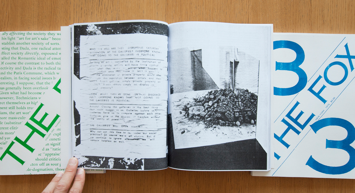
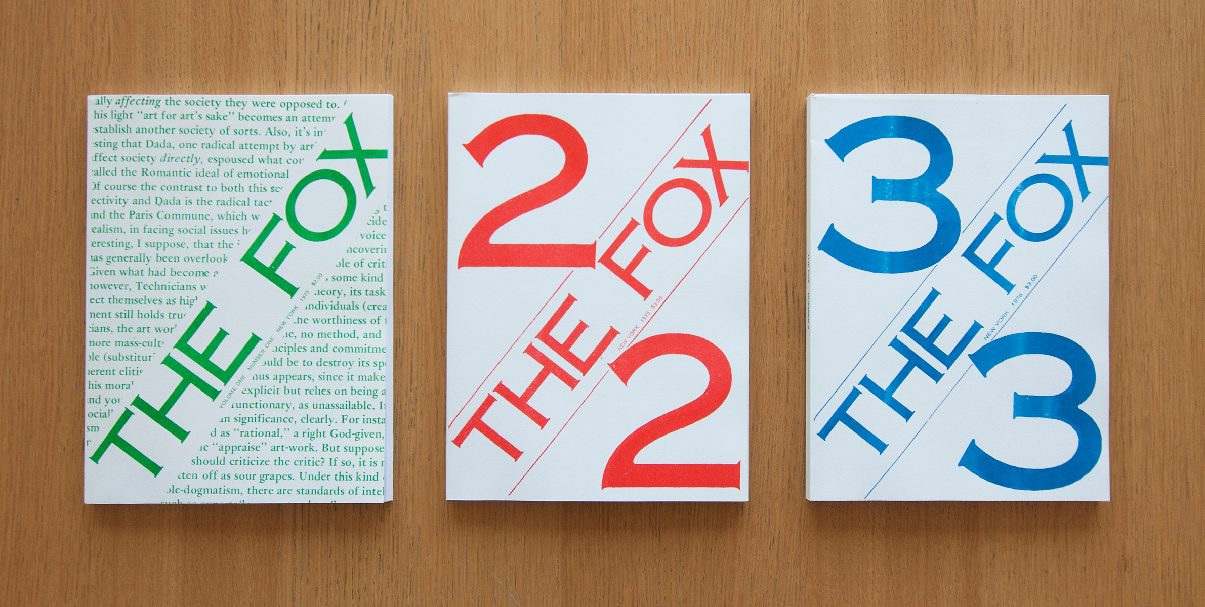
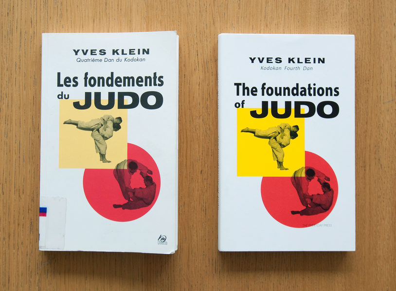
Based in London, The Everyday Press was started by Arnaud Desjardin in 2007 as a continuation of his activities as an artist, a specialist art bookseller, and an academic interested in the history of artists’ books. It contributes to the redissemination of artistic productions of the 1960s and 1970s; however, where Éditions Zédélé stays very loyal to the original books and especially concentrates on widely known titles, The Everyday Press seems more precise and less obvious in its selection and permits itself a wider range of exhaustive titles as a base for their facsimiles. One such title is The Foundations of Judo by Yves Klein. The original, published by Grasset in 1954, was re-edited by Editions Delicta in 2006 and subsequently translated by The Everyday Press in 2009. About The Foundations of Judo, Arnaud Desjardin, founder of The Everyday Press, says, ‘The case of the Judo book is complex because the status of that book changed over time from a Judo Manual – a tool for learning the forms of Judo – to a collected early document of an artist’s interests – a sort of artist’s book. It is that historical change of status that allowed for a translation into English to have an ambiguous status: document, translation, manual, artist’s book.’41 Books published by The Everyday Press are often ambiguous titles that fluctuate between an artist’s book and an informational or educational publication – such as a guide or manual – that changed status over a certain period in history and have been given an artistic value through re-editing the original document. The collection of the Everyday Press isn’t limited to classic artists’ books, but also includes artists’ magazines, pamphlets, manifestos and other periodicals published in an artistic context. As the publisher’s statement notes on the website anagrambooks.com, ‘Publishing is a collaborative process between various individuals, it is more than a chain of production. The Everyday Press works closely with artists, designers and writers to release publications paying particular attention to the book as an object. … The main focus is a formal coherence between the idea and purpose of the books and their material make up: this is primarily done by considering available production technologies and the editorial choices made under particular circumstances.’42 The second artist’s book (or rather magazine) published by The Everyday Press was the series Re: The Fox. These three publications are a bootleg of the magazine The Fox that was founded in 1975 in the United States and lasted only three issues.
Fig. 9: Les Fondements du Judo, Editions Delicta, 2006 (left), The Foundations of Judo, The Everyday Press, 2009 (right).
REVIEW OF ZÉDÉLÉ AND THE EVERYDAY PRESS
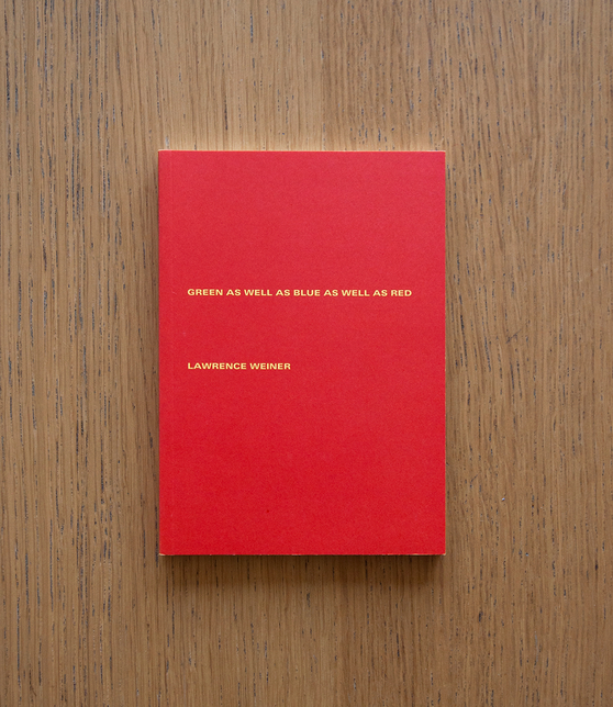
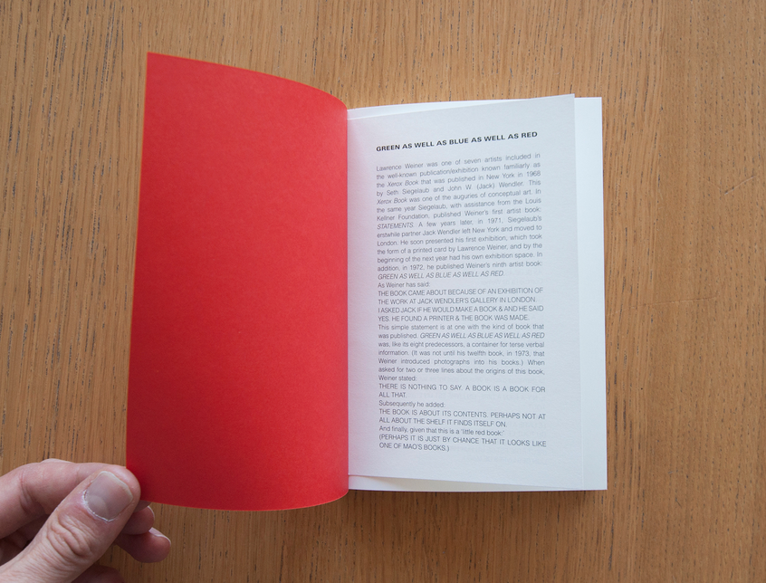
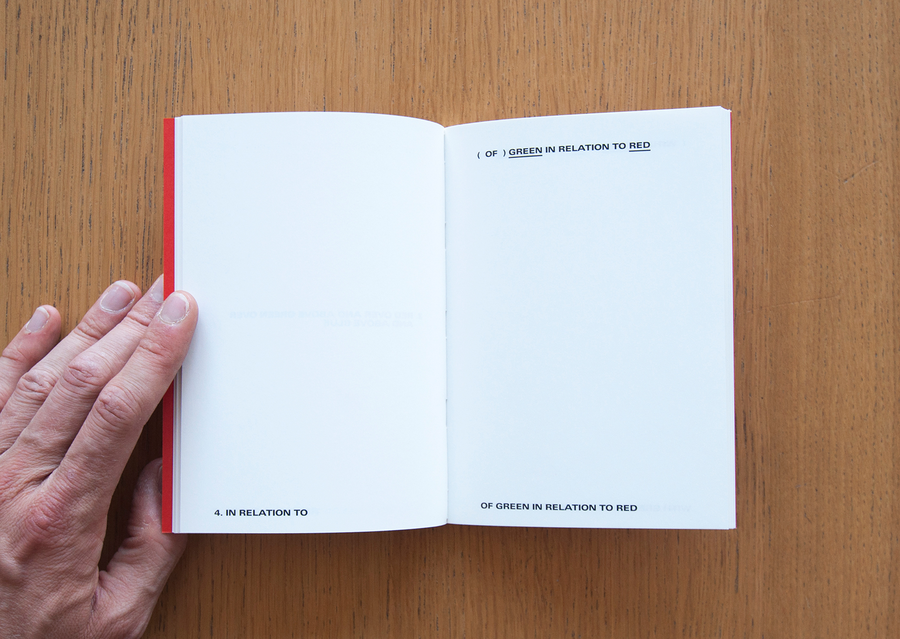
The two reviewed titles from the Reprint Collection are Green as well as Blue as well as Red by Lawrence Weiner and Robin Redbreast’s Territory/Sculpture 1969 by Jan Dibbets. When I received the books by post I was surprised by their size. All the books I received from Zédélé fitted in a little box, which suggests that artists’ books from the 1960s and 1970s are generally small in size. Straight away when handling Green as well as Blue as well as Red (figs 1–3), it feels well-crafted. In a way it looks like a small exhibition catalogue. When inquiring about the background of this book, this seems to be exactly the case. The original by Weiner, published in 1972 by Jack Wendler, was produced in the context of an exhibition in Wendler’s gallery. Weiner notes, ‘The book came about because of an exhibition of the work at Jack Wendler’s gallery in London. I asked Jack if he would make a book and he said yes. He found a printer and the book was made.’43 The reprint by Zédélé measures 120 × 171 mm, has one hundred pages of linguistic content by Weiner, and was offset printed in an edition of one thousand copies. The book is perfect bound, consisting of six sewn booklets of sixteen pages. It is the ninth of a total of fifty books made by Weiner since 1968.
The work in the book consists of purely typographical statements, which is an advantage for its reproduction. All texts are newly typeset rather than scanned, making the texts look perfectly sharp and nicely printed. The interior paper is a pleasant silk cream that goes well with the black texts. The thickness of the cover paper is correct in relation to the interior. The cover is printed with red ink on yellow paper, which gives the side of the cover a subtle yellow line.
The presence of the publisher in the book is modest. The name of Zédélé appears only twice in the whole book: once on the back and once on page four underneath a mention of the original publisher. The editor included a disjointed piece of paper with background information (history, publisher, artist, etc.) about the book and stuck this right after the cover as an additional leaflet that also serves as a bookmark. The text in the leaflet is information that didn’t come with the original book; it doesn’t belong inside the reprint either. Jérôme Dupeyrat notes in his review of the Reprint Collection, ‘This choice is a recurrent one in artists’ books published by Zédélé, but in this case, the postponement of the critical apparatus outside the space of the book is strictly speaking not only aiming to physically distinguish the work itself and the carrier of the comment, but in doing so, also not to turn the reissued book into a document that could be considered different vis-à-vis the first edition.’44 The solution of the loose leaflet is an adaptation for the purpose of separating the content and is applied in all books in the Reprint Collection. The leaflet can be seen as a democratic solution between interrupting the original and not providing any background information at all. In diffusing background information via a detached piece of paper stuck inside the book, the publisher keeps a certain distance to the subject matter, avoiding a permanent imprint. This procedure is contrary to the process of indexing books in libraries, where the institution’s fingerprint is necessary and leaves inevitable traces like stamps, serial numbers, and barcodes.
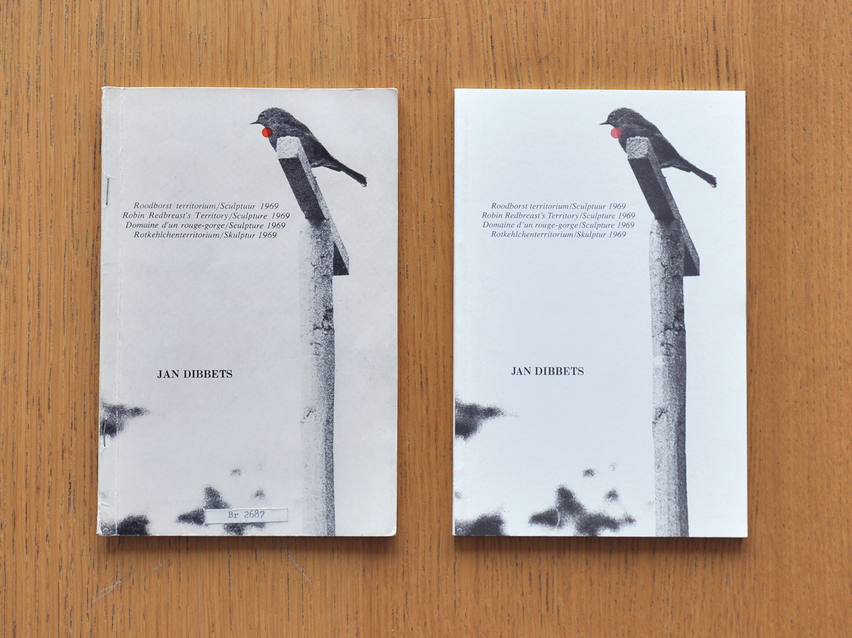
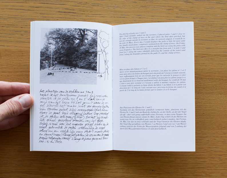
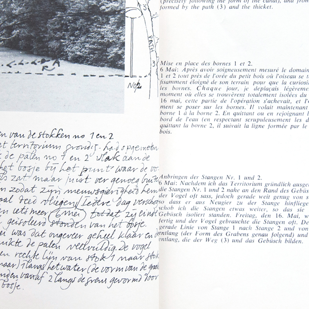
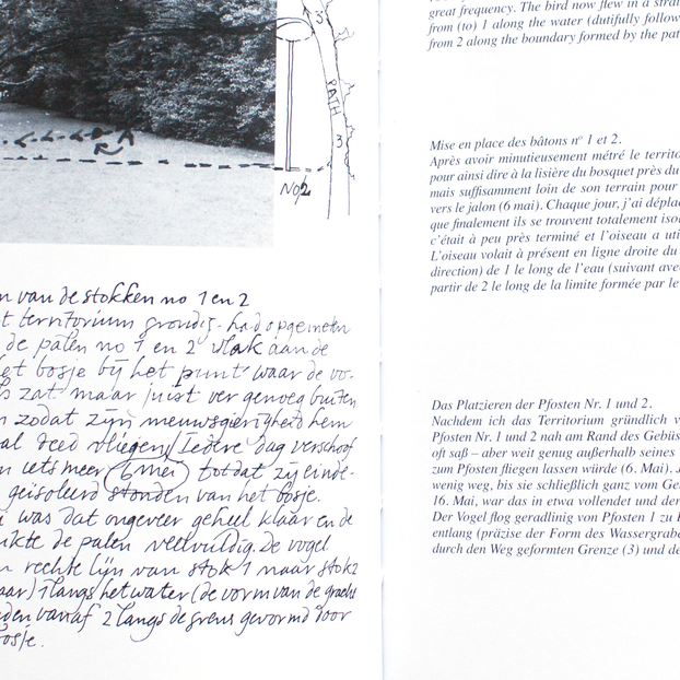
The second book by Zédélé, Robin Redbreast’s Territory/Sculpture 1969 (figs 4–8) by Jan Dibbets, is slightly taller than Green as well as Blue as well as Red but much thinner. The size of the book is 121 × 183 mm and contains thirty-two pages that are sewn and perfect bound. Seth Siegelaub (NY) and Walter König (Cologne) published the original in 1970. The Reprint website provides more background information:
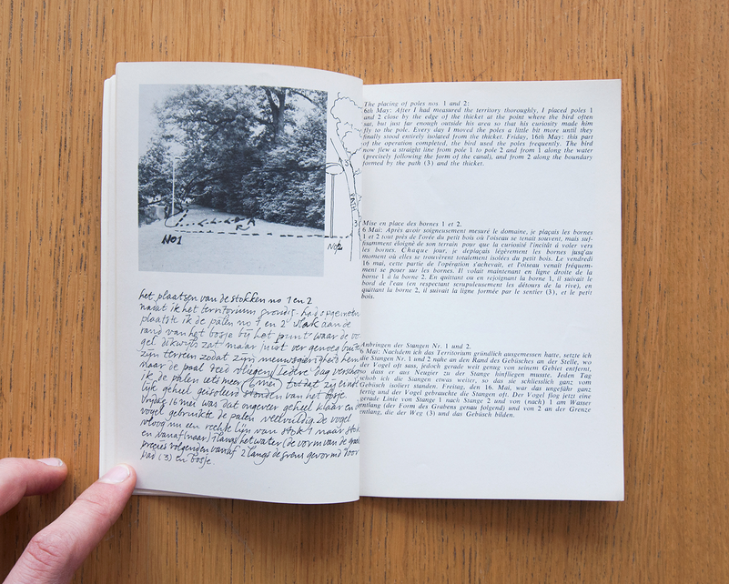
Robin Redbreast’s Territory is a book documenting an installation in an Amsterdam park by Jan Dibbets, who observed and highlighted the movements of a robin through a series of photographs. After learning about the habits of robins, Jan Dibbets decided to extend the territory of one robin, setting new boundaries with poles that the bird would perch on; in this way, the robin participated in the artist’s ‘Drawing in Space’. The book’s left-hand pages feature photographs and topographical surveys, alongside handwritten notes by the artist, which are rendered in three other languages (English, French and German) on the right-hand pages.45
Dibbets worked on this artist’s book – the only one he ever made – with Seth Siegelaub. Siegelaub was among the first voluntarily to take on the role of publisher and editorial curator of works of art using the form of the book as a podium for newly emerging artists. The reprint of Robin Redbreast’s Territory/Sculpture 1969 by Zédélé is an extremely close remake of the original. The same picture appears on the cover, including the red dot that indicates the throat of the redbreast. The contrast on the cover of Zédélé’s edition seems to have been pushed a little, which is beneficial for the book. As a result of the higher contrast, the cover looks bright and white. The cover is printed on a very pleasant matt paper (about 250 grams) that bends smoothly with the rest of the book. The first difference between the re-edition and the original is the binding. The original is a paperback-bound booklet reinforced with staples to keep the binding together, while the new edition is properly sewn and bound. The interior paper seems quite similar to that of the original. It is a white glossy paper (about 120 grams) that is much brighter than the paper used in the original, which has yellowed and discoloured over time. Here again the addition of the publisher is minimal. The name of Zédélé appears once on the back and once on the title page, where it substitutes for the names of Seth Siegelaub and Walter König, who signed the original. The page after the title page states, ‘All rights reserved, Jan Dibbets and Zédélé éditions’, indicating a collaboration between the artist and Zédélé, or that the copyright is shared.
The handwritten texts in Dutch by Dibbets are scans from the original and reproduced as such. Translations of Dibbets writing are placed on each right hand page. The paragraph appears in three languages, successively English, German and French, and is retypeset in a similar typeface to the original. All translations are revised for this new edition, and the original negatives are polished and raised in contrast to optimise the image quality. A leaflet with additional information is included right after the cover, on the exact same spot as in the other books from the Reprint Collection. The book is made with a lot of care and does perfect justice to the original.
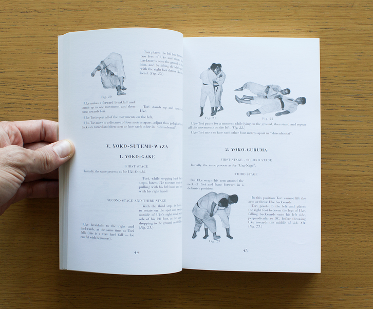
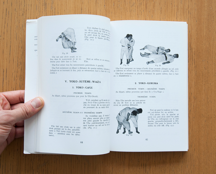
In 2009 The Everyday Press published the third version of Les Fondements du Judo (figs 9–11) by Yves Klein, which was first published in 1954 by Éditions Grasset and later reprinted by Édition Dilecta in 2006. Klein’s judo manual derived from a journey of a year and a half to Japan in which the artist studied the combat sport under the ninth-Dan judo master Oda. After he became one of the first European citizens to receive a fourth-Dan black belt, Klein returned to France to open his own Judo academy.46 The book is richly illustrated with hundreds of photographs of Klein and leading Japanese teachers demonstrating the six major katas (the movements that form the basis of judo).47
The Foundations of Judo is the first edition translated into English, a so-called transimile of the original: ‘This first English edition of Klein’s Les Fondements du Judo might, to borrow a term from the artist and writer Merlin James, be best described as a transimile. It is a translation and, as far as is practicable, a facsimile of the 1954 Grasset edition. All of the photographs and diagrams are taken directly from the original and the text follows its unusual layout and typesetting as closely as possible.’48 The book is produced by The Everyday Press in close collaboration with artist and first-Dan black belt judo practitioner Ian Whittlesea.49 It measures 140 × 230 mm, has 256 pages printed in black, and the booklets are sewn and perfect bound. The cover is printed in full colour on a thicker paper, which is wrapped around the book. The original edition by Grasset was made like this as well, but the re-edition by Dilecta doesn’t have the cover wrapper. The Everyday Press is loyal to the first edition when it comes to editorial choices. The same goes for the interior of the book. The publisher decided to keep all the errors found in the texts, as noted in their statement at the end of the book: ‘There are numerous small errors in Klein’s text, most caused by the speed at which the manuscript was prepared for printing. The transliteration of Japanese names for techniques is often idiosyncratic and inconsistent, and there are several mistakes in the ordering of stages within the katas, as well as a number of typographic errors. All of these original errors have been retained.’50 An incomplete list of errors follows this statement, so the reader is informed and knows where the errors are. Furthermore there is an appendix with supplementary texts from the second French edition from 2006 translated into English. The English edition is thus a facsimile of the original edition that takes into account the additions from the second edition, which makes the English version the most extensive and complete of the three editions to have appeared. Although it is the third edition in a sequence, the publisher states on the back of the book that it is the ‘First English Edition’. The editor regards the aspect of translation as being of considerable importance and without doubt it was the major part of the project, together with the layout of the book. This is most noticeable in the credit line: ‘The right of Ian Whittlesea to be identified as translator of this work has been asserted in accordance with Section 77 of the Copyright, Designs and Patents Act 1988’,51 which entitles Whittlesea to be regarded as the rightful owner of the translation. Although Whittlesea probably did most of the physical work for this reprint, his name doesn’t appear on the cover as author or co-author, but he has been accommodated by The Everyday Press. Further acknowledgement of Whittlesea’s work is given on the title page and at the back of the book.
As noted in the publisher’s statement, all texts are typeset after the original, somewhat atypical layout. The texts look perfectly sharp in this edition compared with the Delicta edition of 2006, where the texts were scanned from the original and reproduced as such. The images in the Everyday Press edition are scans from the original book, and are therefore of low quality, which is an obvious result considering the method of reproduction and the possible absence of the original negatives. In general the additions of the publisher are quite obvious, but the name of the publisher isn’t communicated too excessively. The only significant difference to the cover is the text on the spine of the book, which is turned upside down. The direction of the spine lettering is an indication of the provenance of the book, as each country has its own conventions. The Foundation of Judo is a rather atypical artist’s book. The texts are mostly explanatory, guiding the apprentice through the exercises in a tangible and rational way. It is edited and designed by artist Yves Klein, and therefore is an artist’s book, but the syntax of the book is that of a guidebook or educational publication.
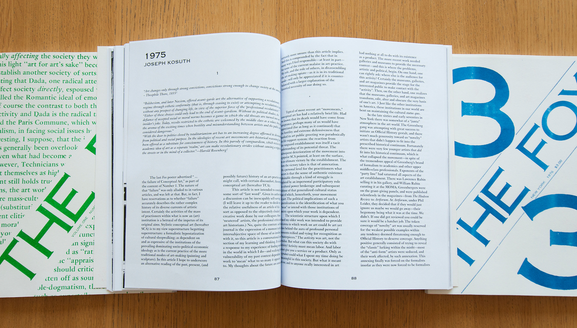
The editorial series The Fox, published between 1975 and 1976, crosses editorial borders as well. The Fox isn’t a typical artist’s book from the 1970s. This journal, as described by the authors in the first issue, alters between an artist’s magazine and a critical periodical. It was edited by Sarah Charlesworth, Michael Corris, Preston Heller, Joseph Kosuth, Andrew Menard, Mel Ramsden, and Ian Burn, all members of the New York faction of the British Art & Language movement. The Fox arose out of ‘frustration … with the extremely oppressive nature of a very elitist and rather irrelevant (in terms of effective practice) theoretical debating society which was Art & Language,’ according to Sarah Charlesworth’s ‘Memo for The Fox’ in issue 2.52 It was primarily text based and printed on newsprint paper with uncoated cardboard covers. The short-lived magazine – only three editions were published – had a self-consciously crude, unfinished look that corresponded to its Marxist agenda. In addition to polemical articles by the editors, The Fox published papers developed out of the Artists Meeting for Cultural Change and other politically oriented articles and criticism.53
Emily King, design editor at Frieze magazine, reflects on the design choices of the original magazine series: ‘The Fox does not carry a design credit, but it is usually assumed to be the work of Kosuth. With its cardboard covers and newsprint interior the magazine makes a feature of its economy, but its typography, although simple, is extremely elegant. The covers display the issue number and the title, set diagonally in Copperplate Gothic. The same typeface is used in the interior of the magazine for headlines, and text is set in a straightforward two-column grid. Illustrations are used sparingly – there are no reproductions of art works – but to great effect.’54
Art & Language in Britain poorly received The Fox, as witnessed by the derisive review published in Art-Language 3, no. 2. In the third and final issue of The Fox, a transcript of discussions entitled ‘The Lumpen-Headache’ aired some of the tensions between the two groups, and chronicled the developing discord within the American faction of Art & Language itself, problems that would soon cause the American group to disband, and The Fox to end.55
The Everyday Press published a limited facsimile reprint of the three issues
of The Fox named Re: The Fox (figs 12–14). The reprint of the three issues aims to rediffuse the texts and ideas in a form as close as possible to the original periodical. Arnaud Desjardin notes about his intentions to publish Re: The Fox:
What we did with The Fox is a sort of bootleg second edition. … It was quite the labour of love, which isn’t necessarily apparent. It tries to be as close to the original as possible, using the desktop printing technologies available today. This means it is inevitably different and new in its material make-up. I wanted to have a form of release that could be self-printed, basically a PDF, produced through desktop technology. For me, legibility of the printed text was paramount. The cheap, 1970s machinery that it was originally printed on is possibly equivalent today to a desktop laser printer. Re: The Fox is not about fetishizing the original by creating a facsimile, but a sort of material emulation of the original all the same.56
Re: The Fox is indeed an identical copy of the original publication. Nowhere in the three editions is a visible or written sign of the publisher noticeable. No logo of, credits for, or address information for The Everyday Press is given. The designer who worked on the magazine is completely untraceable. The facsimiles have high-contrast Risograph-printed covers on white cardboard and each issue is attributed a different colour for the title: number one is green, number two is red, and number three is blue. The colours derive somehow from the original versions. Although the original first edition seems to be printed in black, an advertisement printed in green circulated to announce the first number. The original second number was red, and the third was printed in black again, with an announcement printed in blue. Strictly speaking, the colours thus derive from the ads and not the covers. The magazines are perfect bound and the interior is laser printed in black on ordinary offset paper of about 80 or 90 grams. Concerning the conceptual intentions of the magazine, Arnaud Desjardin says: ‘What is also reflected in The Fox is the art scene and a sort of post-conceptual crisis, the magazines were quite uncompromising with almost no images. Questions about what it is to make art and for whom, social questions about society and politics, were prevalent then. I guess I’m interested in those radical voices from the past and their attempt at changing things. Those original ambitions and questionings in The Fox seem to me to have some contemporary relevance.’57
The Fox clearly distanced itself from other artists’ books of that period because of the preeminent critical texts and the space it offers for collective reflection instead of being the product of one person. Re: The Fox is well produced and used a modest production method – laser print – that gives the magazine its ephemeral quality. On the other hand, the historical value and critical content of the series make the work an object to preserve and revise. Although not directly credited, the presence of the graphic designer is evident in Re: The Fox. To retypeset such a body of text is a huge task carried out with much patience by someone who has at least basic knowledge in layout and typography. It is not the most creative task for a graphic designer, but is nonetheless a job for which precise experience is needed.
The two reviewed books by Éditions Zédélé differ greatly in terms of content and concept, but show some similarities in their production methods. The cover paper seems the same for both books, the size of the books by Weiner and Dibbets is almost the same, and both books are assembled the same way. When I compare these two books with other titles by Zédélé, a clear visual resemblance is noticeable. They are all offset printed on a pleasant range of interior and cover papers. The colours Zédélé uses are of high contrast – black is absolutely black – and belong to a colour gamut close to primary colours. In particular, the colours used for the covers of their books help to shape the collection as an entity. The care taken in the production of their books is a pleasure for the eye. These corporate choices impede diversity within the Reprint Collection but
help establish a clear identity for the entire collection. It is unclear whether there is a graphic designer involved in the production of the books of the Reprint Collection. Any design credit is completely absent, whether on Zédélé’s website or in the books themselves. All credits go directly to the publisher in the person of Galaad Prigent, and to the editors Anne Mœglin-Delcroix and Clive Phillpot. In his essay ‘Books, Bookworks, Book Objects, Artists’ Books’, Clive Phillpot says something that would suggest Zédélé should mention the artisans involved in their projects: ‘Few so-called artists’ books are actually the result of a single person’s labour, even though one person may be responsible for the idea. Not many artists are involved in the entire process of book making; photographers, typesetters, printers, binders, and others frequently play a part in the production of the book.’58 As the artist does not always work alone in the production of an artist’s book, credit for the production should go to all actors involved in the project. Although this quotation derives from an article written in 1982, and the typesetters back then have changed into today’s graphic designers, who possess skills that go beyond typesetting a book, Phillpot’s argument goes partly against Zédélé’s way of crediting people, which is restricted to a mention for the editors alone. Books presented on Zédélé’s website also rarely allocate credit for the design. This may suggests that the artist or editor designed the book alone, or an in-house graphic designer was occupied with the layout and production of the books, without publicly receiving credit for it.
The status of editors Anne Mœglin-Delcroix and Clive Phillpot is emphasised by Zédélé as being ‘Two internationally recognized specialists in the field of artist books’ who have ‘both written many studies on the subject’.59 Anne Mœglin-Delcroix is introduced on the homepage of the Reprint collection as ‘Professor Emeritus at the University of Paris I – Sorbonne, formerly in charge of the artist book collection at the Print Department of the Bibliothèque nationale de France, the author of Esthétique du livre d’artiste: une introduction à l’art contemporain (1997, revised version: Marseille: Le mot et le reste & Paris: Bnf, 2012) and Sur le livre d’artiste: articles et écrits de circonstance 1981–2005 (Marseille: Le mot et le reste, 2006).’60 Clive Phillpot, has been an advocate for the artist’s book for more than forty years, as a critic, curator, and editor, and in his tenure as director at the library of the Museum of Modern Art in the late 1970s, where he built the library’s collection of artists’ books and mapped out the field with influential essays that traced its ancestry and distinguished it from seemingly similar genres such as the livre d’artiste.61 Both descriptions indicate that the selection of these heavyweights in the field of artists’ books should be respected. The editors are positioned at the centre of the publisher’s production chain, and function as an overseeing eye to guarantee the quality of the book. But with the emphasis on the editors, the impression arises that the curators of the Reprint Collection, Anne Mœglin-Delcroix and Clive Phillpot, are equally as important as the artists who conceived the books. Although Zédélé succeeds in showing little or no visible intervention in the facsimiles they produce and stay as close as possible to the original, the status and merits of its editors are widely communicated. The artists’ books selected by Zédélé seem to be appropriated rather through the presence of the editors and their expertise, and thereby gain authorship for the reprint. The editors’ network of artists and publishers undoubtedly opens doors to certain titles otherwise difficult to access and reprint, as is indicated by the final phrase of Zédélé’s statement: ‘No options are off the table, from facsimiles to rereleases or to French adaptations with the greatest respect for the author’s original intentions and, whenever possible, in close collaboration with the artist who is the author.’ It’s difficult for a graphic designer to manifest him- or herself in such a hierarchical editorial structure. Even when the graphic designers’ contribution is purely technical, it doesn’t seem to receive the esteem it deserves from Zédélé’s editorial board.
Further arguments by Zédélé for publishing facsimile artists’ books include the scarcity of founding artists’ books from the 1960s and 1970s and the resulting pertinence of reintroducing titles with high historical and educational value for a present generation of artists. Thereby, Zédélé aims for the bigger cause. It is the discourse of a dedicated publisher that wants to do justice to the history and patrimony of artists’ books. The choice of titles – including artists like Peter Downsbrough, Richard Long, and Herman de Vries – is somehow a safe one, but one with cohesion.
The facsimile editions of The Everyday Press are less restricted to an overarching work method applied to the entire collection. Materially there are some similarities, but in terms of subject matter all titles derive from different backgrounds and periods. Arnaud Desjardin notes in a conversation we had about a possible common denominator for his books, ‘If there is one I am not really aware of it, I hate that kind of publisher’s identity swallowing the book. That is a trope of the industrial era of book production. It might catch up with me one day but I’d rather think that each book is different and doesn’t require that sort of fake instant recognition factor.’ When you put all the books of The Everyday Press together, it is difficult to see instant external similarities in terms of size and used materials. Every project, either regular artists’ books or facsimiles, is a new and independent chapter in the total collection of The Everyday Press that entails different historical and theoretical challenges each time, conducted by Arnaud himself in collaboration with the most capable and skilled professionals in the subject. The construction of the editorial team changes for each project, but co-authors and collaborators are at least as present in the production of the book as the publisher himself. When comparing The Foundations of Judo and Re: The Fox, it is surprising to see that a publisher can leave a fingerprint through translation, on the one hand, and be completely invisible, on the other. Both examples stress the diversity of facsimile projects initiated by The Everyday Press. Arnaud Desjardin is a modest publisher who is aware of the stakes and risks of publishing facsimile artists’ books but doesn’t fear to be visible as a publisher when he feels the need to be. About the degree of appropriation he allows in his facsimile projects he states, ‘It’s important to treat the “original” material with an understanding of what it does (or did) but it may be taken in a completely different place. I tend to see it as a form of transmission where I take personal responsibility for the channel and its occasional fuck-ups. I am not interested in robotic repetition. Though my re-issuing stuff in certain settings could be seen as less than faithful.’62 It sounds an honest statement by a publisher who questions the pertinence and accuracy of his editorial practice and suspects possible errors in his activities. It is comparable with the doubts artists and designers may have when commencing a new project over pushing the limits of the project and questioning its pertinence. The modesty of the publisher descends to the books and makes the collection of The Everyday Press in a way less pretentious and more curious. About the increasing tendency for facsimile artists’ books, Arnaud Desjardin notes: ‘In the end some publications should be kept in print and available because they are good but that is only possible if there is a demand. … I believe good books should be kept in print and I don’t subscribe to the fetish of the first edition. Ultimately a facsimile is a form of failure of reproduction: the same but different.’ The pertinence of publishing facsimile artists’ books for The Everyday Press derives from the explicit personal interests of the publisher for certain titles. Projects are not selected because of their possible economic interest or existing historical value. The working methods of The Everyday Press resemble that of an unguided missile – in the positive sense – that responds whenever an occasion presents itself and collaborators and funding are available. One working method stands out when reviewing both facsimiles: the use of linguistic tools to appropriate and process the original content. Both The Foundation of Judo and Re: The Fox are retypeset to achieve the best possible legibility using today’s printing technologies. On top of that, The Foundation of Judo is entirely translated into English. Language therefore becomes a directive element that pushes the publisher to choose a certain printing procedure and the matching prepress techniques. With the choice of retypesetting an entire book, the role of the graphic designer suddenly becomes re-evident. Although it is not the most creative job to typeset a facsimile after its original, it is still a challenge that demands a lot of accuracy and expertise. Contrary to Zédélé Press, Arnaud Desjardin works openly together with graphic designers on titles published by The Everyday Press. By trusting the graphic designer with a task of responsibility, he or she is more likely capable to make conceptual suggestions and apply his or her full expertise to the design and production process of the facsimile. The interest even grows when the graphic designer is particularly engaged in the subject matter, as is the case for The Foundations of Judo, where designer and artist Ian Whittlesea is the carrier of a first-Dan black belt. It seems that The Everyday Press is well aware of the specific roles of the book-making process.
In an unpublished interview Arnaud Desjardin conducted with me, he adds an interesting historical reflection that helps to contextualise the present facsimile tendency among artists’ books: ‘The print run of a lot of Dada and surrealist material for example wasn’t more than a few hundred copies, the stuff wasn’t necessarily a limited edition, it just didn’t interest that many people back then. The 1960s generation got interested in that material that was forty to fifty years old to them, but was really difficult to access and find: it certainly wasn’t in any public collections or libraries, it then warranted re-releasing some of that material in a form sympathetic to the original aims.’ History repeats itself when artists and publishers today put forward similar arguments of scarcity and inaccessibility to support their facsimile projects based on books from the 1960s and 1970s. We’re right in the middle of a cycle and the time is ripe now for a new flourishing facsimile tendency. This cycle is an understandable argument for and underlying inspiration to all actors participating in the production of facsimile artists’ books. It also indicates an expiration date and tension curve for key historical artists’ books that are ready to be refreshed and reintroduced.
All reviewed books by Zédélé and The Everyday Press are extremely loyal to the originals. They stay as close as possible to the initial concepts and visual appearances of their sources, with Re: The Fox as an ultimate example of a facsimile produced identically to its original. Although both publishers obtain very deserving results, it is noticeable that Zédélé struggles more with the historical load of iconic artists’ books. Visually, Zédélé creates a distance between the facsimile and itself as publisher by being cautious in the dissemination of additional information in its books. They also seem to rely strongly on the status of editors Anne Mœglin-Delcroix and Clive Philpott, and, in my opinion, the composition of the editorial team is the publisher’s first act of appropriation. The Everyday Press deals with content in a similarly respectful but more distant way. This is noticeable in the less ‘iconic’ titles they select, but likewise in the discourse of the publisher. The Everyday Press positions itself as vulnerable towards its practice, while Zédélé is more mysterious about certain aspects behind its activities.
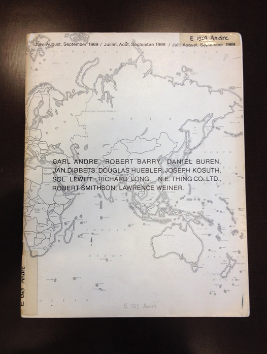
Fig. 19. July, August, September 1969 / Juillet, Août, Septembre 1969 / Juli, August, September 1969, Seth Siegelaub, 1969.
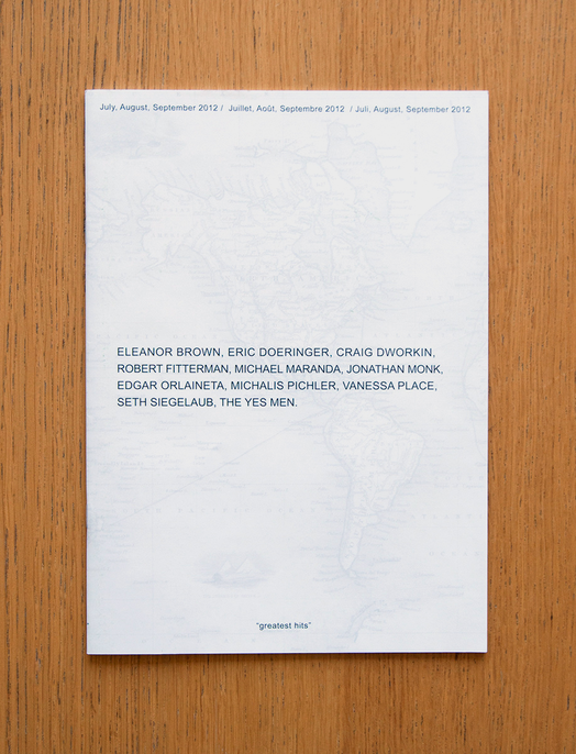
Fig. 21. July, August, September 2012 / Juillet, Août, Septembre 2012 / Juli, August, September 2012, Greatest Hits, 2012.
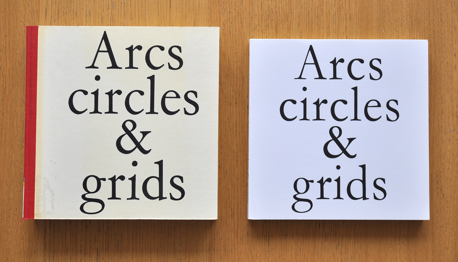
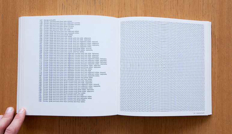
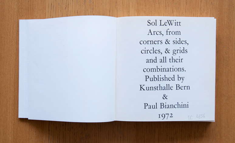
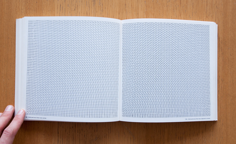
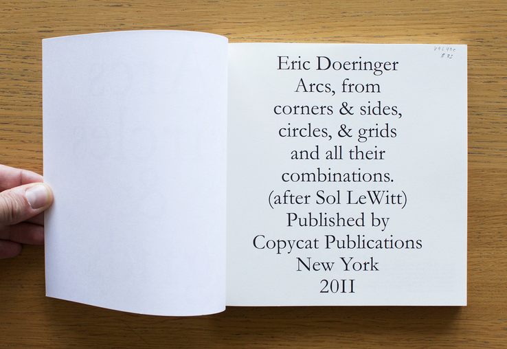
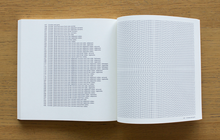
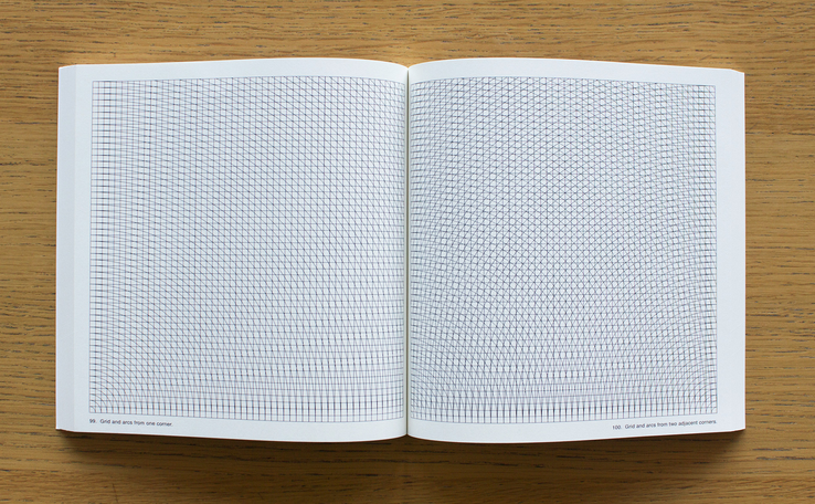
Fig. 27. Arcs, Circles & Grids, Sol LeWitt, 1972 (left); Arcs, Circles & Grids, Eric Doeringer, 2011 (right).
ARTISTS BOOTLEGGING ARTIST’S BOOKS
Besides publishers and editors, it is noteworthy that artists themselves are active in re-enacting exemplary artists’ books from the 1960s and 1970s. Various Small Books, which references artists’ books by Ed Ruscha, features ninety-one re-enactments of Ruscha books by various artists worldwide between 1963 and 2011.63 I reviewed works by the artists Michalis Pichler from Berlin and Eric Doeringer from Brooklyn, New York. They are both actively involved in the appropriation and reproduction of iconic artists’ books, including famous artists such as Sol LeWitt and Ed Ruscha.
As described on MoMA’s website, ‘Appropriation is the intentional borrowing, copying, and alteration of pre-existing images and objects. It is a strategy that has been used by artists for millennia, but took on new significance in mid-20th-century America and Britain with the rise of consumerism and the proliferation of popular images through mass media outlets from magazines to television.’64 In the realm of artists’ books, appropriation of historical content is not an act of theft, plagiarism, or forgery, but a tool for artists to transfer intentional associations of an existing artist’s book to a contemporary context, creating a new reading for historical content. Appropriation results in intentionally ‘owning’ and taking ‘possession’ over content that is not initially yours. It is an act generally accepted in a contemporary artistic context, but could still cause copyright infringement when obtained without permission or respect to the original content.
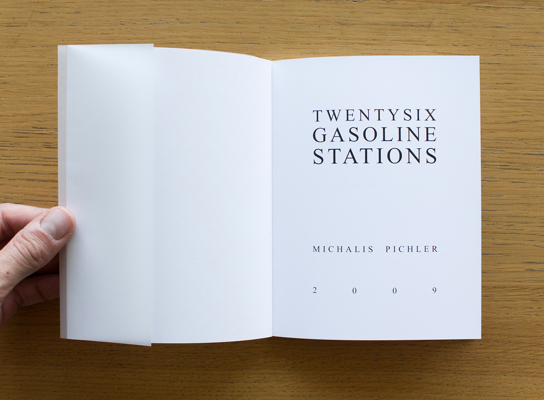
Michalis Pichler edits and diffuses his artists’ books through his Berlin-based imprint named Greatest Hits. He has published bootlegs of books by Ruscha, Broodthaers, and Siegelaub, among others. In 2009 Pichler wrote his ‘Statements on Appropriation’. Statement ten unveils more or less the editorial intentions of Greatest Hits and how the publishing house treats earlier published material: ‘Certain images, objects, sounds, texts or thoughts would lie within the area of what is appropriation, if they are somewhat more explicit, sometimes strategic, sometimes indulging in borrowing, stealing, appropriating, inheriting, assimilating ... being influenced, inspired, dependent, indebted, haunted, possessed, quoting, rewriting, reworking, refashioning ... a re-vision, re-evaluation, variation, version, interpretation, imitation, proximation, supplement, increment, improvisation, prequel ... pastiche, paraphrase, piracy, parody, forgery, homage, mimicry, travesty, shan-zhai, echo, allusion, intertextuality and karaoke.’65 The first point of his ‘Statements of Appropriation’ explains the title of his publishing house and the term Pichler uses for his bootleg and appropriation projects: ‘If a book paraphrases one explicit historical or contemporary predecessor in title, style and/or content, this technique is what I would call a “greatest hit”.’66 A greatest hit isn’t just a copy of an earlier published book, but can strongly differ from its predecessor as long as one or several primary aspects – like the title, style, or content – stay intact in the new artist’s book. In other words, a ‘greatest hit’ is a version of a historical artist’s book appropriated by Pichler that contains high significance to its predecessor but leaves enough room for modification and addition. It is an ambiguous entity that uses the notoriety of a predecessor to communicate the new and unexplored. The two ‘greatest hits’ reviewed from Pichler’s collection are Twentysix Gasoline Stations after Ed Ruscha, and July, August, September 2012 / Juillet, Août, Septembre 2012 / Juli, August, September 2012 after Seth Siegelaub.
Ed Ruscha first published Twentysix Gasoline Stations in 1963 (although the title page states 1962) in an edition of 400 numbered copies. It was subsequently published in two unnumbered editions of 500 copies in 1967 and 3,000 copies in 1969.67 The original book, the first of a series of photographic artists’ books by the artist between 1960 and 1970, consisted of black-and-white pictures of twenty-six petrol stations situated along Route 66 between his house in Los Angeles and his parent’s house in Oklahoma City.
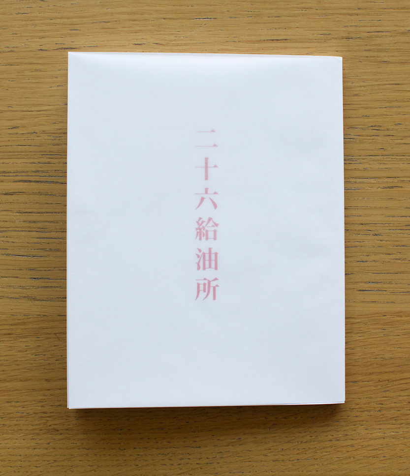
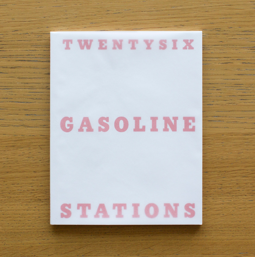
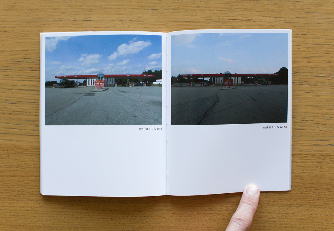
The re-enactment of Twentysix Gasoline Stations (figs 15–18) by Michalis Pichler carries the same title and cover as the original. The book – published by Greatest Hits (Berlin) and Printed Matter (New York) – has a bright white cover with the title set in thick red typography over three lines. A translucent wrapper protects the cover. The size of the book is similar to that of the original – 180 × 140 mm – and is offset printed on standard glossy paper about 120 grams thick. Pichler’s book only features sixteen gasoline stations, which contradicts the title of the book and results in a reduced number of pages – thirty-six in Pichler’s book against forty-eight in the original. All filling stations are photographed on different locations in Brandenburg, Thuringen, Sachsen-Anhalt, and Mecklenburg-Vorpommern in Germany. Where Ruscha photographed different stations run by different companies, all gasoline stations in Pichler’s book belong to the French oil and gas company Total. The names of the gas stations don’t appear in the image captions, as is the case in Ruscha’s book. The title page is set up in a similar way, except that Pichler uses a different typeface for the title, author, and year of publication. Pichler published his book twice. The first print run consisted of 600 copies and the second was of 1,000 copies. It was not specified whether the book I reviewed belongs to the first or second edition. Furthermore, credit is given to Ruscha’s version by a mention in the bibliography, which consists of only one title. The original book was dedicated to Patty Callahan, Ruscha’s girlfriend at that time, while Michalis Pichler dedicates his version to a colleague, Japanese artist Misaki Kawabe. The major difference regarding the photographs of the filling stations is the addition of colour in Pichler’s series and that all stations belong to the same company. Pichler set a strict rule for his photographic series. The photos are all framed the same way and taken from a frontal point of view, which results in different conditions of sunlight exposure for each location and inevitably some backlit photographs. While the images in Ruscha’s book use the whole spread as canvas, all photos in Pichler’s book have the same size and are always placed on the right-hand page. Pichler finishes his photographic sequence of gas stations with a picture in which the artist holds up a piece of paper saying, ‘The eccentric stations were the first ones I threw out’. This message refers to the lower number of sixteen gas stations that appear in Pichler’s version, instead of twenty-six in the original. The book ends with a Japanese translation of the title on the back of the cover. The book is well produced; in particular, the cover and wrapper are very convincing. The interior feels less successful because of the paper and the average photographic quality of the images.
A second ‘greatest hit’ by Michalis Pichler is a bootleg of Seth Siegelaub’s exhibition catalogue July, August, September 1969 / Juillet, Août, Septembre 1969 / Juli, August, September 1969 titled July, August, September 2012 / Juillet, Août, Septembre 2012 / Juli, August, September 2012 (figs 19–22). Organised by Seth Siegelaub, the exhibition invited eleven artists around the world to participate with a new work especially made for the occasion. Siegelaub began his curatorial practice as a gallery owner concerned with the dissemination of conceptual art through commercial means. He worked on several editorial projects between 1968 and 1971 that explored the book as a carrier for exhibitions and as an alternative to the gallery space.68 The trilingual catalogue July, August, September 1969 / Juillet, Août, Septembre 1969 / Juli, August, September 1969 (English, French, and German) served as a document to locate the invited artists and their work. Participating were Carl Andre in The Hague, Robert Barry in Baltimore, Daniel Buren in Paris, Jan Dibbets in Amsterdam, Douglas Huebler in Los Angeles, Joseph Kosuth in New Mexico, Sol LeWitt in Düsseldorf, Richard Long in Bristol, N.E. Thing Co. Ltd. in Vancouver, Robert Smithson in Yucatan, and Lawrence Weiner in Niagara Falls.
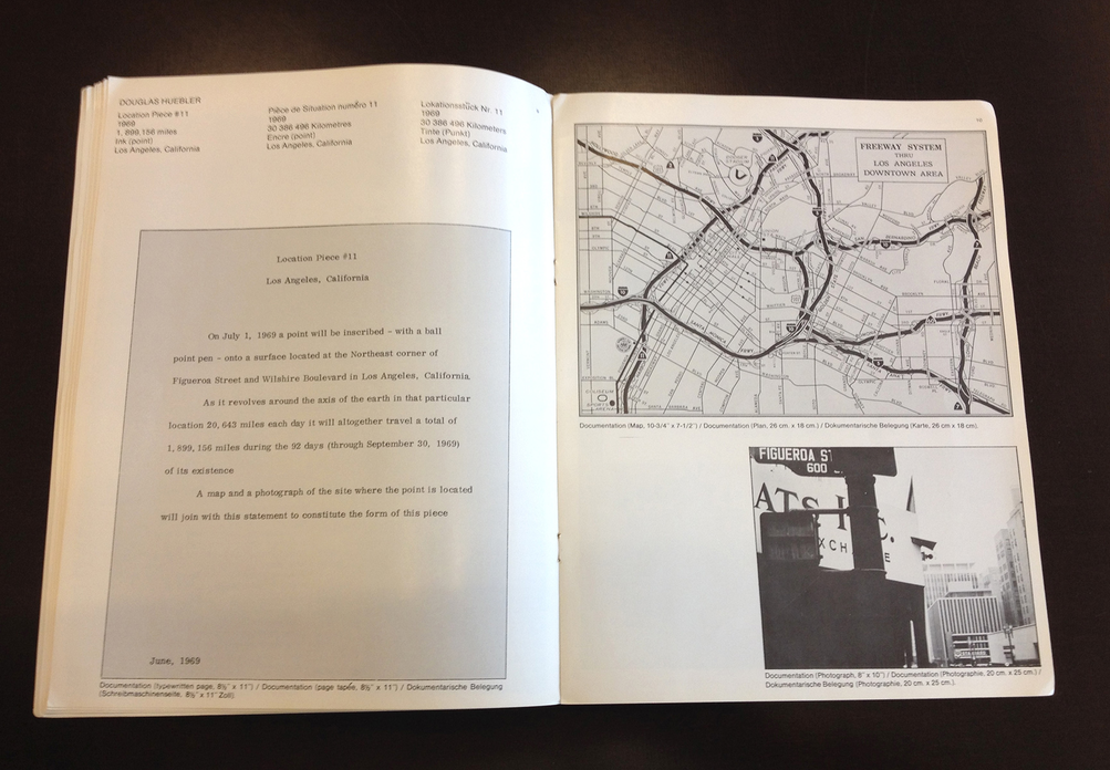
The edition published by Greatest Hits follows the exact same structure as its predecessor. The major difference is the list of participating artists and their locations. The book is printed on a glossy magazine paper of about 90 grams and is staple bound. It’s entirely offset printed in black and white and has a non-specified print run. All texts in the book are set in the same typeface and size as in Siegelaub’s original. The entity feels a bit distant because of the domination of the white paper and chosen typeface, but in general it is well produced and doesn’t show any sign of bad expertise. The original is visibly shorter and wider than Pichler’s bootleg, which measures 210 × 297 mm. Another remarkable difference is the map printed on the cover. It is flipped compared with Siegelaub’s version and is printed in a low percentage of black, which makes the cover slightly pale. The image is hardly visible compared with the original cover. What sticks in the end is the heritage of Siegelaub’s ideas applied in a contemporary context with other participating artists. Pichler’s appropriation leans heavily on the original publication, partly due to the participation of Siegelaub. His inclusion seems very important and to be one of the reasons Pichler initiated the bootleg. Inviting the initial editor is a way of increasing one’s own network, and will stimulate the participation of other artists as well. Pichler’s own contribution is completely dedicated to a meeting with Seth Siegelaub in Amsterdam. It is a rather spare photograph of what must be the entrance to Siegelaub’s apartment in Amsterdam. Written next to the photo is, ‘Doing a trip to Amsterdam in the summer, trying to meet Seth Siegelaub, taking a picture.’ The double page speaks of the attempt of an apprentice trying to encounter his teacher, or a fan who wants the signature of a favourite idol. Siegelaub’s contribution to the book is an informational text about an open-ended critical research project by the Egress Foundation tucked away in an artist’s book. It is as if Siegelaub agreed to participate in return for a piece about his association. The attempt to create something specific for the occasion seems unexploited. Eric Doeringer also participated in Pichler’s book with a bootleg of Douglas Huebler’s contribution to the 1969 edition. Michalis Pichler lists the original version – as he did in Twentysix Gasoline Stations – as the only title in the bibliography and thus the sole reference for the bootleg. The line of reference is part of a bigger paragraph with credits, translated into three languages. Here all artists – and Seth Siegelaub in particular – are thanked for their participation and cooperation. Below the word of thanks, credit is given to Maria de Sande for typesetting the catalogue and to Antoine Lefebvre and Raphaëlle Lacord who worked on the French translations of the texts. It is interesting to see that Pichler collaborated with a typesetter for this catalogue. Until then, I had the impression that Michalis Pichler avoided any interference of designers in his book productions, but in this case he entrusted the typesetting of the catalogue to someone else. The credits end with the notification that a PDF of the book is available at www.stichtingegress.net [site discontinued] or www.primaryinformation.org.
The two books from Greatest Hits are heavily inspired by and made after but never are an exact copy of the original. I cannot suppress that I find Pichler’s way of appropriating historical artists’ books a bit dispassionate and phlegmatic, in terms of both the conceptual intentions and the technical production of the books. One can assume that Pichler did all the work for the books by himself, because no credits for collaborators are found in either reviewed book.
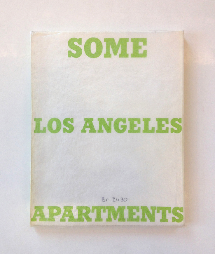
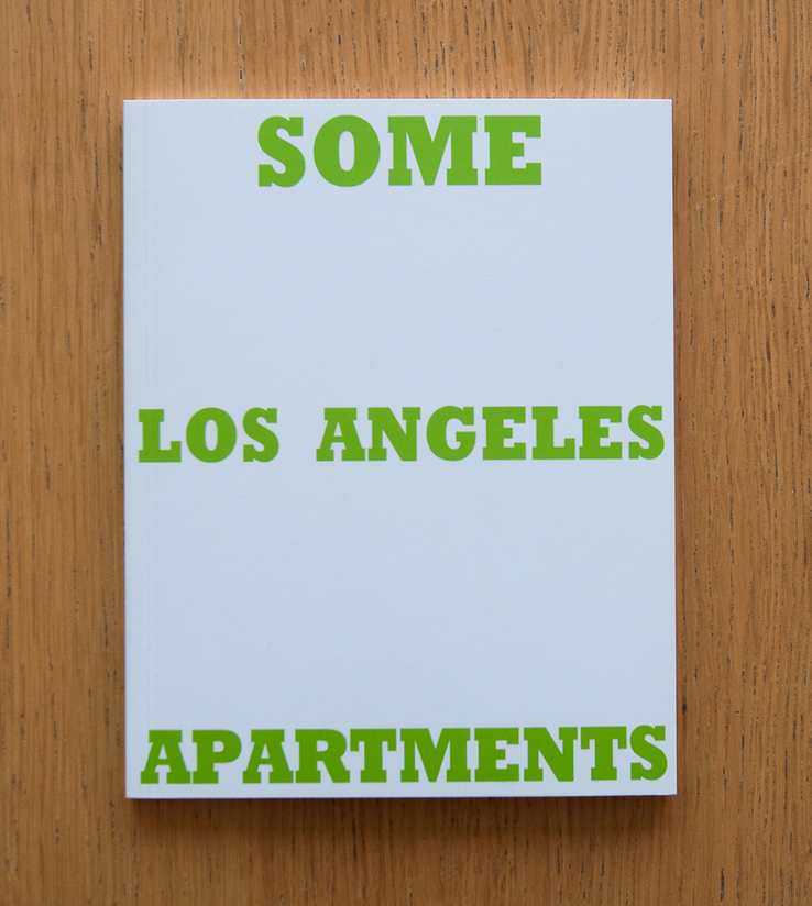
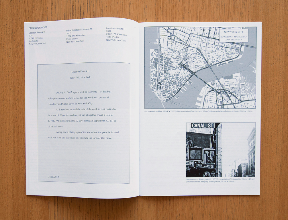
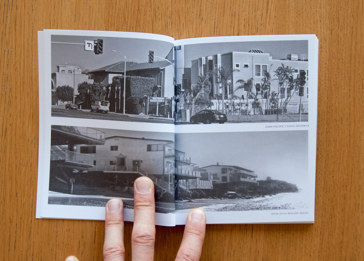
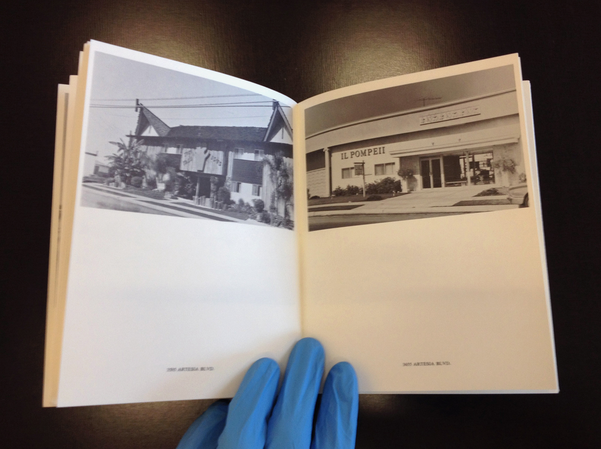
Eric Doeringer also operates on behalf of a self-launched publishing house. The imprint, named Copycat Publishing, produces mainly ‘recreations of classic artists’ books’, which are not to be compared with the original or seen as facsimiles or reprints, as is noted in the publisher’s webshop. It is specified that all books contain ‘new content inspired by the earlier books’.69 Doeringer calls his appropriations of historical artists’ books ‘bootlegs’. Born in Cambridge, Massachusetts, and working and living in Brooklyn, New York, he started to gain recognition with his bootleg series formed of copies of famous artists’ paintings, which he sold outside art fairs and on the streets of the Chelsea art district in New York. Doeringer states about his activity dating from 2001, ‘My Bootleg series was inspired by the guys selling fake Louis Vuitton handbags and Rolex watches on Canal Street. I figured that since contemporary art was another luxury good/status symbol, why not sell cheap knock-offs of Damien Hirst and Richard Prince?’70 When Doeringer was asked about his criteria for which artists to bootleg, he responded: ‘I choose artists whose work I think will sell. My selection is based on the art market, not my own preferences. It’s all the “art stars”. The artists also have to have iconic styles that can be reproduced quickly and easily.’71 He provides no intellectual discourse about the greatness of the artists he copies, but gives an utterly clear and honest answer about lucrative sales opportunities resulting in the choice to copy established artists such as Keith Haring, Gilbert and George, and Andy Warhol. A bit later in his career, from 2009 onwards, when Doeringer started to show interest in bootlegging classical artists’ books, the necessity to reference well-known artists was still present but the economic strategy managed throughout the ‘bootleg series’ quietly moved to the background and was no longer the artist’s primary concern. About his artist’s book collection Doeringer states, ‘I don’t see these pieces as bootlegs, per se. The Bootlegs were about the art market and the artist as brand, my new work is more about the relationship between the original and the copy. The Bootlegs were low-quality copies, whereas my new pieces mimic the “look” of the originals as closely as possible while simultaneously drawing attention to their differences.’72 The ‘bootleg series’ gave Doeringer the necessary publicity and recognition. He subsequently focused on bootlegging artists’ books, in particularly selected books by Ed Ruscha and Sol LeWitt as a reference. So far, he has copied four titles by Ruscha and three by LeWitt. One of his first bootlegs after Ed Ruscha was Some Los Angeles Apartments (figs 23–26) from 1965 (first edition), published by Doeringer in 2009. Some Los Angeles Apartments featured apartment buildings throughout Los Angeles photographed by Ruscha in the artless way of ordinary real estate brochures. For his bootleg, Doeringer revisited all the locations from Ruscha’s book and took photos of the same apartments from similar vantage points, only now forty years later. The result is a vivid update of the apartments that figured in Ruscha’s book. Most of the buildings remained visually unchanged but a few had been demolished and replaced by new buildings. Doeringer documented this new architecture as if the previous building were still standing, staying loyal to the photographic angles Ruscha choose forty years earlier. Street names are placed as captions under the photos as in the original. Both versions are identical in size, 14 × 18 mm, with a total of forty-eight pages.
The book doesn’t open that easily because the booklets are glued rather than sewn, as is the case in Ruscha’s version. The perfect binding method and relatively thick cover paper does not allow the pages to flip in a smooth and natural way. The original also had a dust jacket – a similar one to Twentysix Gasoline Stations – which is absent from Doeringer’s version. The paper used in the original is a bit thicker as well. When one looks closely at the texts printed in Doeringer’s book, it is curious that they are all rasterised, even the title on the cover. There are a few possible explanations for this but it is difficult to grasp what exactly happened. Texts were possibly set in 90 per cent grey during the typesetting process and therefore automatically rasterised for the print process. Doeringer could have done the layout of his book in Photoshop, which is unimaginable, but would explain the rasterised texts, as Photoshop is not vector-based software. Another possibility is a mixture of techniques where the street names are scanned – and thereby rasterised – and Doeringer’s images of the apartments are placed in the layout on top of those scans. It is at least unlikely that Doeringer scanned all texts, because he typeset new additions to his book, such as the title page and the copyright attribution. The rasterised outcome of texts is more likely due to the printing process, and thus out of the direct control of the artist. Images are of poor quality as well. They look slightly flat and greyish and lack contrast. The white margins around the images vary constantly, which suggests an error committed during the binding process. Ruscha’s version, on the other hand, is very well printed and has a better density than Doeringer’s book. It is clear that today’s print-on-demand techniques have opened doors, but quality is not automatically guaranteed and still depends on the expertise of the printer.
The book contains a note allocating copyright to Doeringer himself. He says about this act, ‘My main reason for placing the copyright in the publication was to replicate Ruscha’s original books as faithfully as possible and they included a copyright within the text’s composition.’73 The addition of this own copyright is as much an act of appropriation as being faithful to Ruscha’s original. There is only the cover and title that could be considered as an infringement of Ruscha’s copyright, for the rest the book exists of new shot material by Doeringer and belongs to him only.74 It is therefore a strange justification by Doeringer, while he could simply have said that he is the rightful owner of this version of Some Los Angeles Apartments. Still, the copyright question is a persistent one when parts of the referenced work are identically adopted in the new version.
Regarding the bootleg of Arc, Grids & Circles (figs 27–33) by Sol LeWitt, Doeringer made a very clever intervention to avoid copying the exact drawings from the original. LeWitt’s work consists of line drawings of all possible combinations of arcs, grids, and circles. These combinations take into account both the type of line (arc, circle, grid) and all the possible points on the page from which an arc can derive.75 Doeringer changed the original size of the book and therewith the interaction of the lines in the drawings. He explains: ‘Because my book is slightly smaller than LeWitt’s (7.5” square vs. 8”), the arcs, circles, and grids intersect in different places. Thus although they might appear identical, my drawing of “Arcs from one corner and two opposite sides” is completely different than the one in the original book.’76 One may ask what the exact interest of this change is, beside making forms that are technically different from LeWitt’s. When browsing through both books one does not notice the difference immediately. I discovered the difference through Doeringer’s website, otherwise I might have overlooked it. In contrast to Some Los Angeles Apartments, Grids, Arc & Circles is extremely well made. The bootleg after Sol LeWitt’s eponymous book from 1972 is 196 pages long. It feels comfortable and flexible at first glance. For the interior, the artist used a paperback paper with little bulk of around 80 or 90 grams, which makes the book bend easily. Flipping through is a real pleasure for a bibliophile. The cover is printed on a flexible gloss cardboard of about 200 grams. It has a possible spot UV varnish on the front, but inside has been left rough. This creates a smooth transition to the more yellow paperback paper of the interior. The cover of the bootleg is much more affirmative than its predecessor because of the paper and intensity of the ink. The high-contrast title image hits the reader immediately.
All differences between the original and the bootleg are of a linguistic nature. On the spine, the name Sol LeWitt is replaced with that of Eric Doeringer, and on the title page the preamble has been changed from ‘Sol LeWitt’ to ‘Eric Doeringer’. Added as well is ‘After Sol LeWitt’, a direct reference to the original. The publisher’s credit has been changed from ‘Kunsthalle Bern & Paul Bianchini, 1972’ to ‘Copycat Publications, New York, 2011’. On the following page there’s an imprint noting Eric Doeringer as the copyright holder and prohibiting anyone from reproducing any part of the book without the written permission of the artist. It also gives more information on the manufacturer of the book and gives the artist’s website as a reference point. The book follows the original layout very strictly. The chapter pages remain unchanged and illustrations have similar captions to before. The illustrations aren’t scans of the original book but seem to have been digitally redrawn. The lines are sharp and don’t show any characteristics of scanned illustrations, such as noise or raster dots.
Although the final results vary greatly, both bootlegs by Eric Doeringer show similar approaches to appropriation. At first the books seem to be exact copies of their predecessors, but the more you dive into them, the more Doeringer’s fingerprints become visible. An obvious appropriation method practised by Doeringer is the substitution or manipulation of content detected from the original artist’s book throughout the entire structure of the bootleg. With the slightest changes, as visible in Arc, Grids & Circles, Doeringer knows to exchange his layer of information with that of the initial book. The covers of his bootlegs inevitably embrace the iconic and economical values of the original works, and turn Doeringer’s books into ambiguous objects between bootlegs and facsimiles. To quote Mark Rawlinson on the common strategy of appropriation
in bootlegs: ‘Many books riff on Ruscha’s use of language and the titles of his photo books, some through literal replication or through inversion of the original title, others adopt the title as a sort of template, ignoring specific phrases or words and borrowing instead the metric rhythm of the title.’77 The title is therefore a very important anchor for the appropriation of an iconic predecessor. The new title should have a link with the original title, as examples from Various Small Books show. The title of the bootleg showcases a linguistic interpretation, an exact copy, or a different phrase using the original metric rhythm. In applying this method, the bootleg is assured a certain visibility and recognition in the legacy of that particular artist’s book. The connection to the original is easily made. This clarifies in part why all the reviewed books stick closely to or completely adapt the original title and cover of their predecessor. Only once you enter the bootleg do they start to distance and identify themselves.
In terms of book production, artists from the 1960s and 1970s practised the production, printing, and distribution of their books as an integral part of the book concept. The professional field of book making was differently fragmented. Printers and publishers were perfectly capable of assisting in the design process and providing the layout of a book, a task that today is normally given to a graphic designer. Jan Dibbets talks about his relation with his publisher, Seth Siegelaub, while working on Robin Redbreast’s Territory/Sculpture 1969 in 1969: ‘I told Seth about it. He immediately was very enthusiastic and after I delivered him all the material, he took care of everything. I only worked with Seth.’78 That Dibbets gave Siegelaub his material and trusted him to produce a well-printed book is a sign of confidence and a clear separation of tasks. Dibbets worked on the concept and Siegelaub – acting as typesetter and publisher – took care of assembling, printing, and distributing the book.
This largely contradicts the working methods of Eric Doeringer and Michalis Pichler, who both work more solitarily in their bootleg projects. Nowhere in Doeringer’s publications is there a reference or credit suggesting collaboration. Pichler credited the typesetting and French translation for July, August, September 2012 / Juillet, Août, Septembre 2012 / Juli, August, September 2012, but worked alone on Twentysix Gasoline Stations. Furthermore, the term ‘typesetting’ is a rather antiquated description for ‘graphic design’ or ‘layout’. It essentially includes the placement of all typography on a page, and, in the case of July, August, September 2012 / Juillet, Août, Septembre 2012 / Juli, August, September 2012, the layout was already defined by the original. To ‘typeset’ is a technical definition that doesn’t include any of the conceptual work that takes place in defining the layout and concept of a book. It is therefore a collaboration with very limited creative influence. When analysing both artists’ methods of appropriation, it seems they accept little interference regarding the production of their bootlegs. It raises the question whether working alone is the ultimate method of appropriation for an artist. At least it corresponds with the initial working method embraced by artists from the 1960s and 1970s.
The bootlegs of Michalis Pichler and Eric Doeringer show similarities in their methods of appropriation, but are very different when it comes to their marketing strategies. Pichler states in the second point of his ‘Statements on Appropriation’, ‘Maybe the belief that an appropriation is always a conscious strategic decision made by an author is just as naive as believing in an “original” author in the first place.’79 While Pichler claims not to have any particular strategy when publishing bootlegs, for Doeringer, having a strategic plan was entangled with his motivation for the bootleg painting series preceding his artists’ books: ‘I painted small copies of paintings by all the art stars and hawked them outside of art fairs and Chelsea galleries for a fraction of the price charged by “legitimate” dealers.’80 Doeringer is very open about the economic interest of his work. Pichler does not openly pursue sales numbers, but the name of his website – www.buypichler.com – reveals a part of the understandable wish to sell books after all.
Propelled by economic interest, Doeringer decided to produce some of his bootlegs in open editions, meaning the book is available as long as there is demand. Each copy is individually produced on demand and has the same production costs, in contrast to more conventional offset printing, where bigger print runs reduce the cost per copy but a total number of copies must be determined before going to print. In essence, an ‘open edition’ is a clever way of not ending up with huge stocks and keeping books available at all times. Doeringer’s Arcs, Circles & Grids is his first book published in an open edition. Although there are many benefits to print-on-demand, there is a downside for Doeringer as a critical publisher: ‘I would like to publish more books on demand, but the problem for me is that most of the Print On Demand companies offer a limited number of book sizes, and I’m usually trying to match an existing book and need specific dimensions.’81
Where the production of facsimile artists’ books already attacks the much-discussed problem of the scarcity of key artists’ books – a specifically attractive commodity for antiquarians and book collectors – the introduction of print-on-demand does this even more, and is a blessing for the democratisation of contemporary artists’ books and re-enactments in particular.
Fig. 22. July, August, September 2012 / Juillet, Août, Septembre 2012 / Juli, August, September 2012, Greatest Hits, 2012.
Fig. 20. July, August, September 1969 / Juillet, Août, Septembre 1969 / Juli, August, September 1969, Seth Siegelaub, 1969.
CONCLUSION
Throughout the analyses, different discourses in favour of re-enacted artists’ books were investigated. The facsimile productions by Zédélé and The Everyday Press show a very accurate and precise approach that stays as loyal to the original as possible, while the bootlegs produced by artists Michalis Pichler and Eric Doeringer show precise alterations to the structure of the original books. The latter is a method of appropriation – bootlegging – where the artists’ own reflections are applied to a context defined beforehand, preserving several key elements of the original and modifying others. It seems difficult for the artist simply to reproduce the original identically. There seem to be personal added elements necessary to define a bootleg as a new artistic statement. As the reviewed examples showed, artists start to tweak, change, interpret, differentiate, and modify the selected sources eventually to aim for authorship over their work, especially when bootlegging a historical artist’s book. Artists, more than publishers, try to leave a trace in the legacy of a specific bootlegged artist’s book. The argument and search for authorship as a method of appropriation seems to predominate among artists over any possible economical interest for the new work. Even Eric Doeringer, who started bootlegging famous artists’ paintings out of economic interest before turning to bootlegging artists’ books, states that the relationship between the original and the copy is of more interest to him than the money he could earn.82
A secondary underlying human argument among artists is the admiration for a particular artist and his or her body of work. In the work of Pichler and Doeringer, admiration shines through here and there as well. Doeringer is very honest about this aspect of bootlegging: ‘My “Ruscha” books are certainly fanboy pieces. Going out to LA and visiting all of the locations in his books was like making a pilgrimage.’ It can be assumed that Michalis Pichler had Ruscha’s trip in mind when driving down the highways of Germany in search of gasoline stations. In Pichler’s bootleg July, August, September 2012 / Juillet, Août, Septembre 2012 / Juli, August, September 2012, a certain recognition and admiration for Seth Siegelaub is perceptible as well. For this reason, making a bootleg is an attractive way of showing acknowledgement for a fellow artist from an earlier period, and ensures the ‘idol’ has a presence in the here and now.
The most eminent argument drawn from the publisher’s discourse is the urge to make available again historical material that for too long has been unattainable. The interest here is the educational pertinence of reprinting rare artists’ books. The present generation of artists and designers recently discovered the medium and are eager to learn about its evolution in the second half of the twentieth century. It’s difficult to understand the mass production of artists’ books presented at book fairs without knowing the roots of these objects. One even finds some frustration bubbling up when encountering iconic artists’ books online in reviews and behind showcases, where it is impossible physically to flip through these titles. The best thing publishers achieve when they print historical facsimile artists’ books from the 1960s and 1970s is paving a foundation for contemporary and future generations of artists. The excessive number of books generates the impression that artists too often and easily seize the book for artistic expression. A reintroduction of some founding examples could recontextualise the initial artistic intentions of artists’ books from the 1960s and 1970s in today’s art scene and be a support for young artists. Feeding this curiosity is therefore elementary. That Éditions Zédélé and The Everyday Press do not focus on the same range of titles is nourishing and shows the wide spectrum of possibilities. These publishers ensure good books remain available and that the selection of titles is not restricted to only the most popular. Either by responding to a defined collection (Zédélé), or by fitting in for reasons revised at each occasion (The Everyday Press), the choice of particular facsimile titles is consciously made and depends on the available permission of an artist, an encounter with a rare book, meeting a collaborator with similar intentions, or being invited to publish a facsimile in the frame of a specific event. Furthermore, the selection of titles is issued as part of the publisher’s total body of work, each one becoming part of the global artist’s book legacy as an entity of its own, covering a certain place and time.
The economic arguments seem secondary to the arguments for reinserting historical content. Zédélé’s website is well structured, allowing visitors to add each book to a shopping basket and purchase them, and their prices are very reasonable. The website of The Everyday Press, on the other hand, consists of a slideshow of projects, but additional purchase information or a webshop is completely absent. The only possibility to buy their titles is via the website of Anagram Books or at the art book fairs that Arnaud Desjardin occasionally attends. It is possible that both publishers finance their editorial activities through grants in addition to the sales revenue from books sold, but nowhere is any information found regarding their business models.
Reprinting historical material automatically raises questions about copyright and authorship. Publishers and artists are diametrically opposed in arguments of authorship. The reviewed books by both publishers remain very loyal to the material they reissue and cautious when it comes to interfering and appropriating original structures, while books by artists transform or modify the original content, most often in a respectful way. Of the status of appropriation, Doeringer says: ‘Although appropriation is fairly accepted in the art world, its legality is nebulous. Legally, you can appropriate if you “transform” the original material sufficiently, but there is no standard for what the minimum transformation might be.’83 Appropriation is thus a delicate activity, even if it is widely accepted by the art world. It is not so much a question of whether an appropriation of an artist’s book by a contemporary artist will be accepted – this seems part of the game – but in what manner the artist adds something constructive to the legacy of a particular iconic artist’s book. A violation of copyright in the framework of the artist book is somehow in relation to a non-respectful use of the original content. I see copyright in the artist’s book realm as an enclosed and unwritten set of rules that influence and guide the practice of appropriation. These subjective and intuitive rules, composed by the College Art Association under the name ‘Fair Use: Code of Best Practices in Fair Use in the Visual Arts’,84 should be correctly and respectfully depicted by artists when re-enacting historical artists’ books. And because regulations are blurry or left to interpretation, it is up to the artistic community to define and pronounce whether a particular re-enacted artist’s book has been made in a respectful manner. It will be interesting to see who will step up in the near future to declare the difference between a bad copy and a respectful bootleg, and whether it will be accompanied by any set of written rules for future re-enactments.
An integral aspect when appropriating an earlier published artist’s book seems to be the preservation of the original cover. All the reviewed books demonstrated a great respect for the original book. The first signs of appropriation appeared when artists used linguistic interpretations or the original metric rhythm for the covers of their facsimiles. By following the original cover, a bootleg is assured a certain visibility and recognition in the legacy of that particular book. The cover is the ultimate reference and will be judged or recognised by this in the first place. It is therefore vital for a bootleg to have a strong visual link with the cover of its predecessor.
When we look at production methods and the materials used, it is difficult to trace a line of similarities between all the books. Each actor’s preferences are of course noticeable, as are the variety in printing techniques that occur; offset printing, digital printing, and more manual techniques such as laser and Riso printing are most common. Zédélé uses offset printing for their Reprint Collection, and Eric Doeringer mainly uses print-on-demand technology. Books that are printed in large print-runs are usually printed offset. The general standard is high. Of the books reviewed, only those produced by Michalis Pichler leave some questions over the quality of the printing process used.
The covers of contemporary re-enacted artists’ books are in general of higher contrast than those of their predecessors, a remarkable evolution in the outer appearance, due to a combination of improved printing techniques, inks, and types of paper, or a simple preference of the artist for contrasting cover images. All the reviewed books are perfect bound – booklets are either sewn or glued – which seems an inherited habit from the 1960s and 1970s. The perfect binding technique makes the book flexible and is a cheap and modest way to assemble a book. Retypesetting is often preferred over scanning when it comes to the reproduction of texts. This reproduction method causes a huge amount of work but guarantees good legibility, which is definitely beneficial to the final result.
All these parameters belong to the toolbox of the graphic designer. But his or her position in the production of facsimile artists’ books is minimal or absent. There seems to be an occasional demand for a graphic designer in the role of typesetter, which is an important task of a highly technical nature. When working together on a re-enactment with an artist or publisher, a graphic designer is condemned to the supporting role of typesetting after an original, which is ultimately a rather monotonous activity. If the graphic designer is restricted to the production process of a facsimile or bootleg, he or she likely occupies a role as superintendent, checker, overseer, or surveyor. As Alex Gifreu notes about this restrained role of the graphic designer in artists’ publications, ‘In the publication of the artist, the artist must take the lead as she has the most specific role. The role of the designer is to place all the skills acquired in the service of the artist. To seek out the optimum solution for the reproduction of their work, be it in the selection of papers, systems of printing, or the format.’85 There is little reason for the graphic designer to think he or she could contribute much on a conceptual level when working for an artist. Gifreu continues: ‘it [the design] has to stay on a second plane, to comply with premises that can be optimum legibility, order, composition but never, never be over and above the work of the artist.’86 When enrolling in a team with an artist and publisher, conceptual tasks are not up for grabs, but the graphic designer is very capable of giving his or her view on editorial choices. A critical graphical eye could push the production limits of facsimile artists’ books further, and keep the discussion for appropriation vivid from a design point of view. In this way, the role of the graphic designer could expand from a technical specialist to that of a critic for the artist’s book spectrum. And when the designer or typesetter has a personal interest in the subject matter, which is the case for Ian Whittlesea in The Foundations of Judo, the interest in participating rises significantly too.
Few artists’ books are the result of a single person’s labour,87 but it seems that Eric Doeringer and Michalis Pichler make a conscious choice to produce books by themselves, at least until the book goes to the printer. Working alone offers artists the maximum autonomy and avoids possible disagreements about design choices. It also saves production costs in the form of salary. On the other hand, is a graphic designer a collaborator to be mistrusted? Or are arguments against including a designer historically rooted? When analysing the rise of artists’ books in the 1960s it is clear that they started out ruled by artists alone. Artists in the 1960s did not embrace the book and reclaim autonomy over institutions only subsequently to share the captured ground with graphic designers.
If a graphic designer wants to merge completely into the production of re-enacted artists’ books, he or she could propose such a work personally. It is common for graphic designers to work on self-initiated editorial projects, but the question is whether the designer is interested in re-enactment and whether such books can be called artists’ books. Besides that, I question whether it is of interest to graphic designers to stick the ‘artist’s book’ label on their editorial projects. As long as graphic designers are able to carry out editorial projects autonomously, I sense less interest and potential for them in the realm of artists’ books, and re-enactments in particular. This also raises the question whether classifying an independent book project by a designer is actually necessary. Alex Gifreu, designer and initiator of Cru Editions, has a very clear and bold statement on the matter:
The artist’s book doesn’t exist. If you look in the dictionary, the definition of a book is a collection of sheets joined with a cover. Whereas, I’d ask you the question: what is art? It’s clear that since Duchamp anything is art; and since Beuys anybody is an artist. It is impossible to define what an artist’s book is when we can’t define who is or isn’t an artist or what is or isn’t art. More than an artist’s book I like to talk about publications conceived as pieces of work. In the sense, the work doesn’t exist in any physical format other than a publication.88
It is difficult to agree that the artist’s book doesn’t exist, but in my independent graphic design practice I do exactly what Gifreu formulates – conceiving publications as pieces of work. I communicate socially relevant information in a comprehensible way through the book format, which is the case for many artists’ books as well (Some Los Angeles Apartments and The Fox are of significant social relevance for example). I regularly encounter the question whether I position myself as an artist and label my books as such, but I refuse to call them ‘artists’ books’ and also don’t feel familiar with the title of ‘artist’. When I’m asked to identify my autonomous book projects, I prefer to call them pieces of visual research. And, once again, when it comes to re-enacted artists’ books, there is little interest of a conceptual nature for a graphic designer.
Although Twentysix Gasoline Stations by Ed Ruscha is probably the most appropriated artist’s book, it is remarkable that it remains unavailable as a widely distributed facsimile. This raises questions over the selection criteria of artists and publishers. What titles should definitely exist as facsimiles? What titles are suitable for appropriation? And who makes the selection? Is it the task of publishers and artists alone to produce facsimile artists’ books? Will there be institutes in the future, like libraries and arts councils, who will define dissemination programmes for artists’ books and support the publication of re-enacted artists’ books? The institutionalisation of the object goes against the initial principles of the artist’s book from the 1960s and 1970s; nevertheless, today, with a growing number of books and inexpensive production methods such as print-on-demand, the facsimile justifies its pertinence in the realm of the artist’s book. It will gain further value over time, questioning the remaining scarcity of books in this medium. Facsimiles will expand both the legacy and the future of artists’ books by defining new reference points for specific titles. In doing so, the zeitgeist becomes a tool and argument for new appropriations that operate as utterly important educative blueprints for printing techniques, materials, and the editorial choices of publishers and artists over time.
BIBLIOGRAPHY
Blackson, Robert, ‘Once More … With Feeling: Reenactment in Contemporary Art and Culture’, Art Journal, 66.1 (2007), 28–40
Brogowski, Leszek, Éditer l’art: Le livre d’artiste et l’histoire du livre (Chatou: Les éditions de la transparence, 2010)
Brouws, Jeff, Wendy Burton, and Hermann Zschiegner, Various Small Books: Referencing Various Small Books by Ed Ruscha (Cambridge, MA: MIT Press, 2013)
Carrión, Ulises, Quant aux livres / On Books (Geneva: Héros-limite, 1997)
Drucker, Johanna, The Century of Artists’ Books (New York: Granary Books, 1995)
Dupeyrat, Jérôme, ‘Les livres d’artistes entre pratiques alternatives à l’exposition et pratiques d’exposition alternatives’ (unpublished PhD thesis, University of Rennes, 2012)
Dupeyrat, Jérôme, ‘L’exposition des livres d’artistes, ou son impossibilité’, exPosition, 10 May 2016 <http://www.revue-exposition.com/index.php/articles/dupeyrat-exposition-livres-artistes-ou-son-impossibilite/%20> [accessed 2 November 2016]
Gumbrecht, Hans Ulrich, and Michael Marrinan, eds, Mapping Benjamin: The Work of Art in the Digital Age (Stanford, CA: Stanford University Press, 2003)
Herschend, Jonn, and Will Rogan, The Thing, the Book: A Monument to the Book as Object (San Francisco: Chronicle Books, 2014)
Klima, Stefan, Artists Books: A Critical Survey of the Literature (New York: Granary Books, 1998)
Lauf, Cornelia, and Clive Phillpot, Artist, Author: Contemporary Artists’ Books (New York: Distributed Art Publishers, 1998)
Lippard, Lucy R., Six Years: The Dematerialization of the Art Object from 1966 to 1972: A Cross-reference Book of Information on Some Esthetic Boundaries (New York: Praeger Publishers, 1973)
Ludovico, Alessandro, Post-Digital Print: The Mutation of Publishing Since 1894 (Eindhoven: Onomatopee, 2012)
Lyons, Joan, Artists’ Books: A Critical Anthology and Sourcebook (Rochester, NY: Visual Studies Workshop Press, 1985)
Mœglin-Delcroix, Anne, Esthétique du livre d’artiste, 1960-1980 (Paris: Éditions Jean-Michel Place / Bibliothèque nationale de France, 1997)
Phelan, Peggy, Life Once More: Forms of Reenactment in Contemporary Art (Rotterdam: Witte de With Centre for Contemporary Art, 2005)
Phillpot, Clive, Booktrek: Selected Essays on Artist’s Books since 1972 (Zurich: JRP Ringier, 2013)
Ruscha, Ed, Leave Any Information at the Signal: Writings, Interviews, Bits, Pages, ed. by Alexandra Schwartz (Cambridge, MA: MIT Press, 2002)
Walter, Benjamin, The Work of Art in the Age of Mechanical Reproduction, trans. by J. A. Underwood (London: Penguin Books, 2008)
This research is funded by the IRAD department of HEAD – Genève.
With thanks to: Anne-Catherine Sutermeister, Lauren Huret, Catherine Guiral,
Arnaud Desjardin, Michalis Pichler, Steffen Schmidt, Pietro Morandi, Deborah
Fiette, and the Bibliothèque d’Art et d’Archéologie Genève.
© Rob van Leijsen, 2017
