1. INTRODUCTION
5. METHODS
9. REFERENCES
6.1 OVERVIEW
6.3 OUTDOOR PLACES
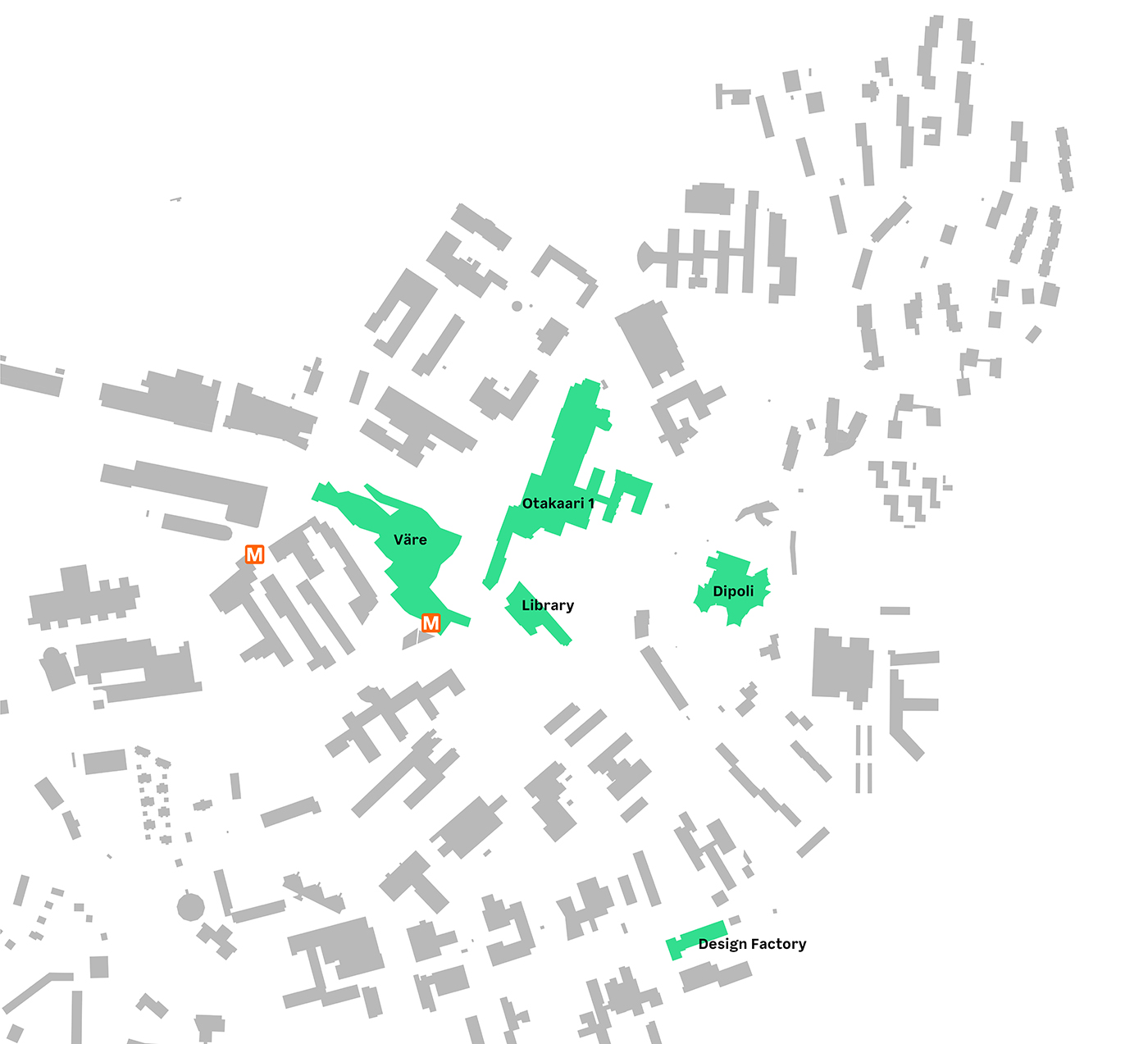
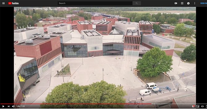
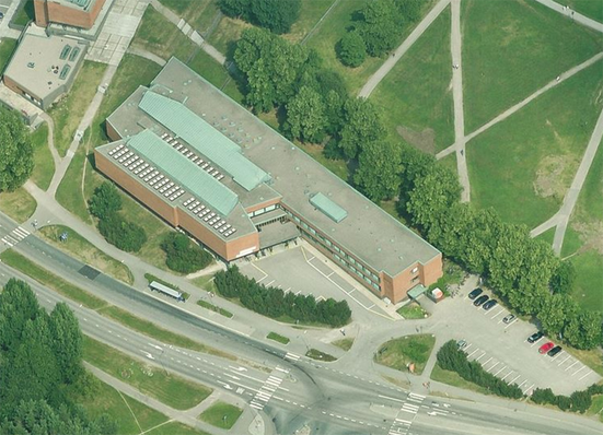
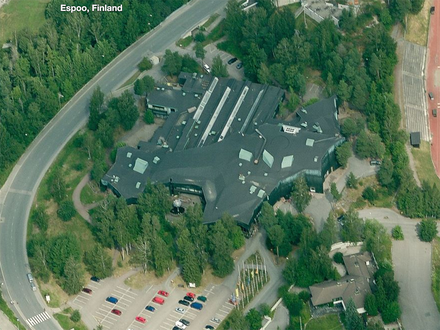
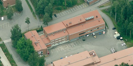
In total, the mental maps had 20 different buildings represented on them. If we compare this number to the actual number of the buildings on campus (49), then only 40% of them were mentioned. That said, even within that 40% the distribution of the buildings was not even: the same five buildings were mentioned in 69% of the cases (Figure 5). These buildings were Väre (the home of the School of Arts, Design and Architecture completed in 2018), Otakaari 1 (Bachelor centre designed by Alvar Aalto as the main university building), Learning Centre (former library transformed into an open space for learning), Dipoli (a former student union building designed by Reima and Raili Pietilä) and Design Factory (a former industrial building).
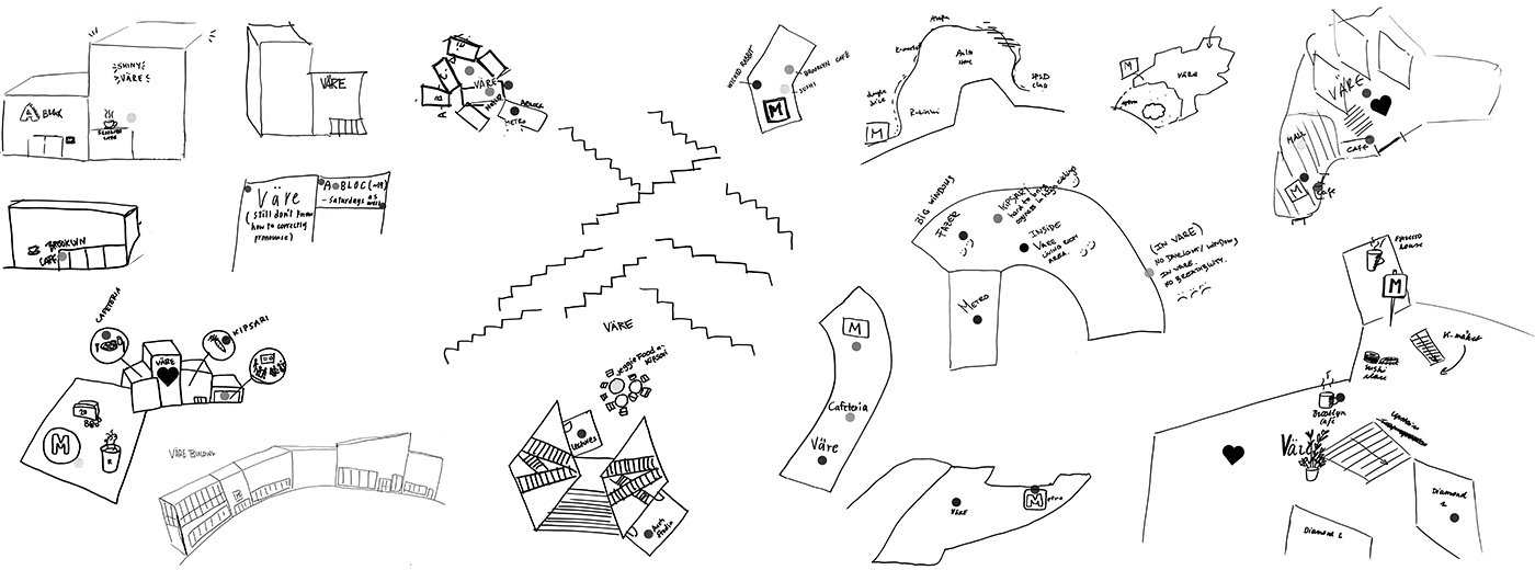
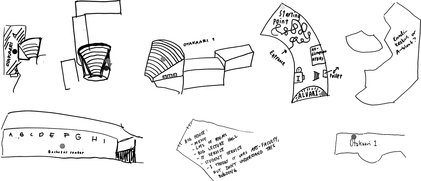
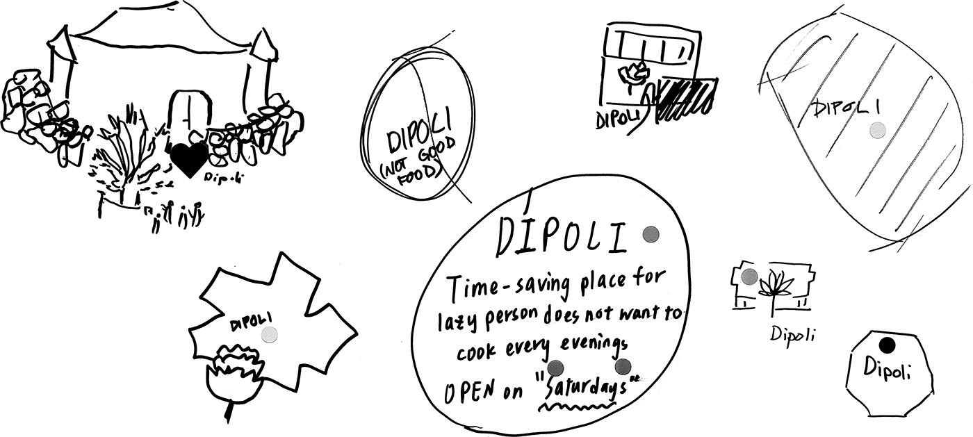
Without a follow-up interview, it was difficult to understand why these places were meaningful for the students. Were they remembered because of their form, their function as study spaces or for other reasons? To clarify this, I looked at how each building was visually depicted on the mental images. More precisely, I made a collage for each of the five buildings, consisting of their representations on different maps. Each collage represents a unique footprint of meaning and value expressed in a visual form.
The mental image of Väre has a vague and loosely defined shape, despite a structured modular organisation. The building is like a container for places inside it, such as cafes and shops. It is remembered as a facade from the outside and as an intricate pattern of staircases inside. Most of the markings on the maps of Väre relate to experiences of food and coffee, with one related to windows and lack of air inside. Metro exists on almost every image of the collage, never as a space, but merely as a symbol. Container metaphor might have something to do with the size of the building, which is close to the size of a block. Smaller, more human-sized entities such as cafes become the supporting nodes of the mental image.
With a size similar to Väre, the Bachelor centre building is structured in a different way, merging with the landscape that surrounds it by means of descending terraces. In most of the mental images Otakaari 1 building appears in the form of its most distinct physical element, an amphitheatre, which dominates the landscape. Apart from this element, the building is portrayed through the contrast between the round shape of the amphitheatre and rectangular shapes of the building’s wings. The interiors of the building do not not have many distinct elements. One of the mental images represents Otakaari 1 as a maze, referring to the experience of getting lost in a complex building. Another image refers to it as a "messy big house" which the author of the map does not understand.
What is striking about the representations of the library is how different they are from Väre and the Bachelor centre, although those buildings are only 3–5 minutes away. When students draw the library, they concentrate on the interior spaces. These spaces are filled with books, different chairs (including those with the round shape), and coffee. These representations convey an embodied experience of being inside with a compact yet multi-sensory environment designed for various activities. The form of the building becomes secondary to its content, which has a special meaning for the students.
Dipoli is a building with a distinct symbolic form and a sculpture in front of it which resembles a pine cone. This symbolic interpretation dominates the mental images. It is a shape close to a circle with a symbol for the cone sculpture and with landscape elements around it. The written comments focus on its functional value: the building has a student restaurant that is open on Saturdays which reduces the necessity to cook for those who live in the student village.
Design Factory is portrayed in several ways: first, through its laconic factory-like form, second, as a space for events where the stage is a dominant element, and, lastly, it is mentioned as a place for significant memories. One person mentions that Design Factory is a place where they have learned and self-developed a lot. Another person talks about the contents of the space: the cosy kitchen, the inspirational, creative and playful atmosphere, the sauna and hang-out spaces. The very presence of Design Factory on so many of the mental images is unexpected: the building is located some distance from the main activities and transport connections, and it is not on the way to anywhere. Given that Design Factory does not have regular classes that students attend but rather holds one-off events, it must be quite memorable to appear in so many representations of Otaniemi.
6.3 OUTDOOR PLACES
7. DISCUSSION
8. CONCLUSION
